Knowing what to write in an invitation can leave you stumped!
It doesn’t need to be complicated, yes you can go all formal and follow the rules. But really, all you need to make sure is that you include all the key details.

What to include in a bridal shower invite
Here are some key details to consider:
- Header:
- Start with a catchy or elegant header that sets the tone for the event, such as “You’re Invited!” or “Join us for a Bridal Shower Celebration.”
- Honoree’s Name:
- Begin the invitation by mentioning the name of the bride-to-be or the couple (if it’s a co-ed shower) to make it clear who the event is for.
- Event Details:
- Date: Include the date of the bridal shower.
- Time: Specify the start time and, if applicable, the end time.
- Venue: Mention the name and address of the venue where the bridal shower will take place.
- Theme (if applicable): If the shower has a specific theme, mention it here.
- Dress Code (if applicable): Indicate if there’s a specific dress code, such as casual, formal, or themed attire.
- RSVP Information:
- Provide a deadline for guests to RSVP by and include the name and contact information of the person to whom they should respond. This can be an email address, phone number, or an RSVP card.
- Gift Registry (optional):
- If the bride has a gift registry, include the relevant information, such as the store name or website, to assist guests in choosing a gift.
- Additional Instructions (if necessary):
- If there are any special instructions or requests, such as bringing a dish for a potluck-style shower or bringing a recipe for a recipe-themed shower, mention them here.
- Closing:
- Conclude the invitation with a warm closing, such as “We look forward to celebrating with you!” or “Your presence is requested to honor the bride-to-be.”
- Sender Information:
- Sign off with the host’s name(s) or the person(s) responsible for organizing the shower.
Remember to use appropriate language and tone that reflects the style and formality of the event. You can get creative with the design and layout of the invitation to match the theme or the bride’s personality.
Overall, the invitation should clearly convey the essential details of the bridal shower and create excitement for the upcoming celebration.
Example of a formal invite
You’re Cordially Invited to a Bridal Shower
Honoring Sarah Thompson before her special day
Date: Saturday, September 10th, 2023 Time: 2:00 PM – 5:00 PM Venue: The Grand Ballroom at The Regency Hotel Address: 123 Main Street, Cityville Dress Code: Black Tie/Formal Attire
Kindly RSVP by August 30th, 2023 RSVP to Jennifer Parker at jennifer.parker@email.com or (555) 123-4567
Gift Registry: Sarah is registered at Luxe Home Decor and Bloomingdale’s.
We look forward to your presence at this joyous occasion as we celebrate the bride-to-be.
Hosted by the Maid of Honor and Bridesmaids: Jennifer Parker, Emily Johnson, Lily Adams
For any inquiries, please contact Jennifer at (555) 123-4567 or jennifer.parker@email.com.”
Example for a modern bridal shower invite wording
You’re invited!
To Sarah’s Bridal shower
Date: Saturday, September 10th, 2023 Time: 2:00 PM – 5:00 PM Venue: The Loft Event Space Address: 456 Oak Street, Cityville
Attire: Casual and Comfortable
Please RSVP by August 30th, 2023 RSVP to Emily Johnson at emily.johnson@email.com or (555) 987-6543
No Gift Registry: Your presence is the only gift we need!
We can’t wait to spend this special time together, enjoying good company, delicious treats, and creating lasting memories.
Hosted by: Emily Johnson, Jennifer Parker, Lily Adams (Bridal Squad)
For any questions or additional information, please reach out to Emily at (555) 987-6543 or emily.johnson@email.com.”
- 10 Food Ideas for a Bridal Shower Brunch

- 10 Delicious Cold Dip Recipes Perfect for a Bridal Shower

- 13 Delicious Hot Food Ideas for an Unforgettable Bridal Shower

- 10 Simple and Easy Appetizers for a Stunning Bridal Shower

- 10 Delectable Finger Foods Perfect for Your Bridal Shower

- 10 Delicious Pinwheel Recipe Ideas for Bridal Showers Finger Food

Creating and managing a guest list for your bridal shower can seem daunting, but with proper organization and communication, it can be a manageable task.
Planning a bridal shower is a big task. It can be overwhelming but if you are organized you got this. I have all the resources you could ever need to plan the perfect bridal shower.

Creating a bridal shower guest list in 10 easy steps
1. Start with the Basics
Begin by listing the names of your closest family members and friends who you definitely want to invite. This core group will form the foundation of your guest list.
2. Discuss with Your Partner or the couple
If you are hosting it for the couple make sure they always have the last say on the guest list.
If you are hosting and your partner is involved in the wedding planning process, consult with them to ensure you include any mutual friends or family members on the guest list. Their input is valuable and helps create a balanced list.
3. Consider Hosting Constraints
Determine the maximum capacity of your chosen venue and consider any limitations or constraints it may have. This will help you establish an approximate number of guests you can invite.
4. Categorize Guests
Divide your guest list into different categories such as family, close friends, colleagues, and acquaintances. This will help you prioritize and make decisions about who to invite.

5. Set Guest Count Limits
Determine the maximum number of guests you can comfortably accommodate within your budget and venue limitations. This will help you make necessary cuts if your initial list exceeds the capacity.
6. Utilize a Spreadsheet or Guest List Manager
Use a spreadsheet or a guest list management tool to keep track of your guests’ names, contact information, RSVP status, and any specific notes or dietary restrictions. This will help you stay organized and easily update information as needed.
It can be as simple as this one below that you update yourself. You can set up an online RSVP system. Our grab my guestlist spreadsheet for a stylish-looking spreadsheet.
| Full Name | Relationship | Address | Phone | RSVP Status | Dietary Preference | Food Choice | Event Choice | |
|---|---|---|---|---|---|---|---|---|
7. Send Out Invitations Early
Send out your bridal shower invitations well in advance, preferably 12-8 weeks before the event. This gives guests enough time to RSVP and allows you to follow up with those who haven’t responded.
8. Keep Track of RSVPs
Regularly check and update your guest list based on the RSVPs you receive. Follow up with guests who haven’t responded by the designated RSVP deadline to get a final headcount.
9. Communication is Key
Maintain clear and open communication with your guests. Provide clear instructions for RSVPing, include a contact person’s name and email/phone number, and promptly respond to any questions or inquiries.
Be Prepared for Changes: Understand that there may be changes to your guest list due to unexpected circumstances or last-minute cancellations. Be flexible and prepared to adapt accordingly.
10. Follow Up and Send Thank You Notes
After the bridal shower, express your gratitude to your guests by sending out thank you notes. This small gesture of appreciation goes a long way in maintaining good relationships with your loved ones.
Remember, the guest list is a personal choice, and it’s important to invite those who are significant to you and who will contribute positively to the celebration. Be mindful of your budget, venue capacity, and overall vision for the bridal shower. With proper organization and timely communication, you can successfully manage your guest list and create a memorable event for everyone involved.
- 10 Food Ideas for a Bridal Shower Brunch
- 10 Delicious Cold Dip Recipes Perfect for a Bridal Shower
- 13 Delicious Hot Food Ideas for an Unforgettable Bridal Shower
- 10 Simple and Easy Appetizers for a Stunning Bridal Shower
- 10 Delectable Finger Foods Perfect for Your Bridal Shower
- 10 Delicious Pinwheel Recipe Ideas for Bridal Showers Finger Food
When it comes to choosing a venue for your bridal shower, there are various options to consider. The venue you select should align with your desired atmosphere, guest count, budget, and personal preferences.

9 venues to host a bridal shower
1. Private Residence
Consider hosting the bridal shower at your own home or the home of a close friend or family member. This option provides a cozy and intimate setting, and you have more control over the ambiance and decorations. It can be a cost-effective choice as well.
2. Hire an Airbnb
If you don’t want to use your own home then it is becoming more popular now to hire a nice home for the day or night.
You can hire it for a few days so you can go all out with the setup. It takes away the stress of having the event at home, if you know, you know!
3. Restaurant or Café
Many restaurants and cafes offer private event spaces or party rooms that can be reserved for bridal showers. Look for venues that match your preferred style, whether it’s a casual brunch spot, a trendy eatery, or an elegant dining establishment. Check if they have packages specifically designed for bridal showers.

4. Garden or Outdoor Venue
If you prefer an outdoor celebration, consider hosting your bridal shower in a beautiful garden, park, or outdoor event space. This option provides a natural and scenic backdrop, especially during the warmer months. Make sure to have a backup plan in case of inclement weather.
5. Community Centers or Clubhouses
Check out local community centers or clubhouses that often have event spaces available for rental. These venues usually offer versatile spaces that can be customized to fit your bridal shower needs. They may provide amenities like kitchen facilities and ample parking.
6. Tea Room or Afternoon Tea Venue
For a classic and elegant experience, consider hosting your bridal shower at a tea room or a venue that specializes in afternoon tea. This option is perfect for an intimate gathering and offers a sophisticated atmosphere.

7. Boutique Hotel or Inn
Boutique hotels and inns often have private event spaces suitable for bridal showers. These venues can provide a charming and intimate ambiance, along with catering options and accommodations for out-of-town guests if needed.
8. Country Club or Banquet Hall
If you’re planning a larger bridal shower or desire a more formal setting, consider a country club or banquet hall. These venues offer ample space, elegant decor, and professional event staff to assist with planning and execution.

9. Unique and Unconventional Venues
Get creative and think outside the box! Consider venues such as art galleries, museums, vineyards, historic sites, or even a yacht or boat charter. These unique venues can add a touch of novelty and create a memorable experience for your guests.
When choosing a venue, consider factors such as capacity, location, amenities, cost, and the overall vibe you want to create. Visit the venues, ask for recommendations, and review their policies and packages to ensure they align with your vision for the bridal shower.
Top tips for choosing the right venue for you
Choosing the right venue for your bridal shower is an important decision that sets the tone for the event. Here are some top tips to consider when selecting a venue:
- Determine Your Budget: Before you start looking at venues, establish a clear budget for your bridal shower. This will help you narrow down your options and ensure you select a venue that fits within your financial means. Remember to account for other expenses, such as decorations, food, and any additional services or rentals.
- Consider the Guest Count: Make an estimate of the number of guests you plan to invite to the bridal shower. Ensure the venue can comfortably accommodate your expected guest count. You don’t want the space to feel too crowded or too empty. Consider if the venue has minimum or maximum capacity requirements.
- Determine the Atmosphere and Style: Think about the atmosphere and style you envision for your bridal shower. Do you want it to be intimate and cozy, or grand and elegant? Consider the venue’s interior design, decor, and overall ambiance. Ensure it aligns with your desired theme and matches your personal style.
- Location and Accessibility: Choose a venue that is conveniently located for your guests, considering factors like travel time, parking availability, and public transportation options. If some guests are traveling from out of town, proximity to accommodations may also be a factor to consider.
- Amenities and Services: Evaluate the amenities and services offered by the venue. Consider if they provide tables, chairs, linens, audiovisual equipment, or other necessities. Determine if they have in-house catering options or allow you to bring in outside catering. Check if they have a kitchen or food preparation area if needed.
- Flexibility and Customization: Assess the level of flexibility and customization the venue allows. Can you bring in your own decorations, or are there restrictions? Determine if you have the freedom to personalize the space to reflect your vision for the bridal shower.
- Reviews and Recommendations: Research the reputation and reviews of the venue. Look for testimonials from previous clients or ask for recommendations from friends, family, or wedding professionals. This can give you insights into the venue’s quality of service, responsiveness, and overall customer satisfaction.
- Visit the Venue: Schedule a site visit to the shortlisted venues. This will give you a firsthand look at the space, allowing you to assess its size, layout, cleanliness, and overall condition. It also gives you an opportunity to ask questions, discuss specific requirements, and get a sense of the venue’s staff and professionalism.
- Read the Contract: Carefully review the venue’s contract and policies before making a final decision. Pay attention to details such as pricing, deposit requirements, cancellation policies, and any additional fees or restrictions. Ensure you fully understand the terms and conditions before signing.
Remember, choosing the right venue is crucial for creating the desired atmosphere and ensuring a memorable bridal shower experience. Take your time, compare options, and select a venue that aligns with your vision and meets your practical needs.
- 10 Food Ideas for a Bridal Shower Brunch
- 10 Delicious Cold Dip Recipes Perfect for a Bridal Shower
- 13 Delicious Hot Food Ideas for an Unforgettable Bridal Shower
- 10 Simple and Easy Appetizers for a Stunning Bridal Shower
- 10 Delectable Finger Foods Perfect for Your Bridal Shower
- 10 Delicious Pinwheel Recipe Ideas for Bridal Showers Finger Food
A bridal shower and a bachelorette party are both pre-wedding celebrations, but they have distinct purposes and differences in terms of their focus, activities, and guest lists.
We have you covered with our complete in-depth planning guides for both bridal showers and bachelorettes.
Here’s a breakdown of the key differences between the two:
Bridal shower vs bachelorette
Bridal Shower:
- Purpose: The primary purpose of a bridal shower is to “shower” the bride with gifts, well wishes, and advice for her upcoming marriage.
- Guests: The guest list for a bridal shower typically includes close female friends, family members, and sometimes female relatives of the groom. It is a more inclusive event that may involve women of different age groups and generations.
- Activities: Bridal showers often include activities and games that center around the bride. These activities can be interactive, trivia-based, or advice-sharing sessions. There is a focus on celebrating the bride and providing her with support and guidance.
- Tone: Bridal showers tend to have a more relaxed and intimate atmosphere. They are often held during the day and can include a sit-down meal, afternoon tea, or brunch. The focus is on conversation, connection, and honoring the bride.
Bachelorette Party:
- Purpose: The purpose of a bachelorette party is to celebrate the bride-to-be’s last days of being single and to have a fun and memorable night or weekend with her closest friends.
- Guests: Bachelorette parties typically include the bride’s closest friends, usually the bridal party and other close female friends. It is more of a close-knit gathering, and the guest list is usually limited to a specific group of friends.
- Activities: Bachelorette parties often involve a night out on the town, weekend getaways, or special activities such as spa days, karaoke, or dance classes. The focus is on enjoying memorable experiences together and having fun.
- Tone: Bachelorette parties tend to have a more lively and party-oriented atmosphere. They often take place in the evening or night and can involve going to bars, and clubs, or engaging in activities that cater to the bride’s interests and preferences.
While there can be some overlap in terms of guests and activities, the main distinction lies in the purpose and overall tone of the events. Bridal showers focus on gift-giving, support, and advice for the bride, while bachelorette parties are centered around celebrating the bride’s upcoming marriage with a fun and memorable night or weekend with close friends.
Which one is right for you, bridal shower or bachelorette?
Deciding between a bridal shower and a bachelorette party ultimately depends on your personal preferences, the type of celebration you envision, and the dynamics of your relationships with friends and family. Here are some factors to consider when making a decision:
- Purpose: Think about what you value most in a pre-wedding celebration. If you appreciate the idea of receiving gifts, well wishes, and advice from a wider circle of female friends and family members, a bridal shower may be a good fit. On the other hand, if you prioritize having a fun-filled night or weekend with your closest friends and creating lasting memories, a bachelorette party might be more suitable.
- Guest List: Consider the people you would like to include in the celebration. If you have a close-knit group of friends or a specific set of bridesmaids who are instrumental in your life, a bachelorette party could provide an opportunity to bond and enjoy a more intimate gathering. If you want to involve a broader range of female friends, family members, or even colleagues, a bridal shower may be a better choice.
- Atmosphere and Activities: Reflect on the type of atmosphere and activities that appeal to you. If you prefer a relaxed and intimate setting, perhaps with a sit-down meal or afternoon tea, where you can engage in conversations and enjoy games focused on your journey to marriage, a bridal shower might be ideal. If you envision a livelier and more adventurous celebration, such as a night out on the town, a spa day, or a destination weekend, a bachelorette party could be more suited to your preferences.
- Time and Logistics: Consider the practical aspects, such as timing and logistics. Determine how much time and resources you and your friends are willing and able to dedicate to the event. If you have limited time or are planning a destination wedding, a bachelorette party may be more manageable. If you have more time and want to include a broader group of people, a bridal shower can be a flexible and inclusive option.
- Communication with Loved Ones: Discuss your thoughts and preferences with your bridesmaids, maid of honor, and close friends or family members who may be involved in planning or hosting the event. Their insights and input can help you make a decision that aligns with your desires while considering their abilities and availability.
Remember, there is no right or wrong choice. It’s about selecting the celebration that resonates most with your personality, preferences, and the dynamics of your relationships. You can also consider combining elements of both celebrations or having separate events if that aligns with your vision and circumstances.

Having both a bridal shower and bachelorette
If you desire to have both a bridal shower and a bachelorette party, it is absolutely possible to plan and incorporate both celebrations into your pre-wedding festivities.
I would offer to host one yourself or at least have two different people be the host of each one. It is a big task to organize one event, let alone two.
Here’s how you can make it work:
- Communicate your wishes: Discuss your desire to have both celebrations with your bridesmaids, maid of honor, and close friends or family members involved in the planning process. Let them know that you would like to have both a bridal shower and a bachelorette party and explain your reasons for wanting both events.
- Determine the timing: Decide on the timing of each event. You can choose to have the bridal shower a few weeks or months before the wedding to allow for the traditional gift-giving and well wishes. The bachelorette party can take place closer to the wedding, such as a week or a few days before, to create a fun and memorable experience leading up to the big day.
- Delegate responsibilities: Assign specific responsibilities and tasks to different individuals involved in the planning process. This could include designating one person or group to organize the bridal shower and another person or group to handle the bachelorette party arrangements. Clearly communicate expectations, budget considerations, and any preferences you have for each event.
- Consider combining elements: While the two events have distinct purposes and atmospheres, you can still find ways to incorporate elements that overlap. For example, you could have some light-hearted games or activities at the bridal shower to add an element of fun, or you could have a moment during the bachelorette party where guests can offer advice or well wishes to you.
- Manage guest lists: Determine the guest lists for each event based on the purpose and dynamics of the celebrations. The bridal shower guest list can include a broader range of female friends and family members, while the bachelorette party guest list can consist of your closest friends and bridesmaids. However, there may be some overlap in the guest lists, so ensure proper communication to avoid any confusion.
- Plan logistics and budgets accordingly: Coordinate with the respective organizers to plan the logistics and budgets for each event separately. This will help ensure that the arrangements and finances are appropriately managed for each celebration.
Remember, the key is open communication and collaboration with those involved in the planning process. By expressing your desire for both a bridal shower and a bachelorette party and working together to make it happen, you can have the best of both worlds and create memorable experiences leading up to your wedding day.
- 10 Food Ideas for a Bridal Shower BrunchPlanning the perfect bridal shower brunch? Dive into delicious food ideas that will delight your guests and celebrate the… Read more: 10 Food Ideas for a Bridal Shower Brunch
- 10 Delicious Cold Dip Recipes Perfect for a Bridal ShowerCold dip recipes are perfect for bridal showers because they’re easy to prepare and serve, allowing guests to mingle… Read more: 10 Delicious Cold Dip Recipes Perfect for a Bridal Shower
- 13 Delicious Hot Food Ideas for an Unforgettable Bridal ShowerPlanning a bridal shower and want to impress the guests with some tasty hot food options? You’re in the… Read more: 13 Delicious Hot Food Ideas for an Unforgettable Bridal Shower
A bridal shower is a pre-wedding celebration or party typically held for the bride to be before her wedding day. It is an opportunity for close friends and family members to come together and “shower” the bride with gifts, well wishes, and advice for her upcoming marriage.
Traditionally, the bridal shower is organized and hosted by the maid of honor or close female relatives of the bride. However, nowadays, anyone close to the bride, including family members, friends, or even colleagues, can take on the role of organizing and hosting the event.
What happens at a bridal shower
During a bridal shower, guests often participate in various activities and games that are centered around the bride. These activities can include trivia games about the couple, guessing games, or other interactive activities that bring fun and laughter to the event.
Bridal showers are an opportunity for the bride and her loved ones to celebrate and share in the excitement leading up to the wedding day. They often feature decorations, food, and drinks. The specific format and theme of a bridal shower can vary depending on cultural traditions, personal preferences, and the overall style of the event.
Who pays for a bridal shower?
Traditionally, the maid of honor or the bridesmaids would cover the expenses for planning and hosting the bridal shower.
However, in recent times, financial responsibilities have become more flexible and can vary depending on various factors, including cultural norms, relationships, and the preferences of those involved.
How to plan a bridal shower
Discuss with the bride
Your first step should always be to talk to the bride. Ask her about her preferences, expectations, and any specific ideas she may have for the shower. Discuss the guest list, date, theme (if desired), and any particular activities or games she would like to include.
Set a budget
Determine the budget for the bridal shower. This will help you make decisions regarding the venue, decorations, food, and other elements of the event.
If you are the host and covering cost this is easier to decide. If you are all pitching in then make sure you speak to everyone and at least get a rough idea of budgets.
Choose a date and time
Coordinate with the bride and select a date and time that works for her and most of the important guests. Aim to schedule the shower a few weeks to a couple of months before the wedding, allowing ample time for preparations and RSVPs.
Create a guest list
Work with the bride to create a guest list based on her preferences. Consider inviting close friends, family members, and other individuals important to the bride’s life. Coordinate with the bride to collect the necessary contact information for the guests.

Select a venue
Determine the location for the bridal shower. It can be hosted at someone’s home, a rented event space, a restaurant, or any other suitable location based on the budget and the number of guests.
Choose a theme or style
If the bride desires a specific theme for the bridal shower, brainstorm ideas together and choose a theme that reflects her interests and personality. The theme can influence the decorations, invitations, and activities at the shower.
Choosing an overall style or theme is really important to have a cohesive event. It helps let guests know what to wear and expect and makes decorating and styling easier.
Send invitations
Create and send out invitations to the guests. You can choose to send traditional physical invitations or use digital platforms to send electronic invitations. Make sure to include the date, time, location, RSVP details, and any special instructions or requests.
A top tip is to set up a WhatsApp group for everyone or at least the key members so you can chat about any decisions easily.

Plan the menu
Decide if you want a sit-down meal, a buffet, or a more casual setup. Consider people’s dietary preferences and any potential food allergies or restrictions of the guests.
A bridal shower brunch is always a big hit. I love the pizza and prosecco theme, super easy to get pizzas and everyone likes pizza, right?
Organize activities and games
Plan some engaging activities and games for the guests to enjoy during the shower. This can include icebreaker games, trivia about the couple, advice-sharing sessions, or other interactive activities related to the bride or the wedding.
I have put together a list of ideas for games that people actually want to play!
Decorations and Styling
The fun part! Well, my favorite anyway!
Select decorations that will enhance the overall atmosphere of the event. This can include table centerpieces, balloons, banners, flowers, and any other decorative elements that align with the chosen theme or color scheme.

Gifts and Favours
Discuss with the bride if she wants a gift registry or any specific instructions regarding gifts. Inform the guests about any gift preferences or suggestions in the invitations.
Consider what favors you will have for the guests attending. You can do small edible gifts or go all out with gift bags.
Plan the schedule
Create a detailed schedule for the bridal shower, including the timing of activities, gift opening, and any speeches or toasts. Make sure to allocate enough time for each segment while allowing room for flexibility and mingling.
Giving guests a brief timeline is helpful to things running smoothly. You can send this digitally, print if off or have it as a big sign.
Coordinate logistics
Take care of logistical aspects such as renting the venue, arranging for seating, audiovisual equipment (if needed), and ensuring any necessary permits or permissions are obtained.
This is when a planner comes in super useful. Having all the times, and supplier contact details in one place makes any event run smoothly.
Confirm RSVPs and finalize details
Keep track of guest RSVPs and communicate with the venue, vendors, and any individuals involved to confirm arrangements and finalize details.
If you have a big event with a large guest list I would have an online RSVP system if possible. If not keep a spreadsheet yourself that can be easily shared.
Execute the plan
On the day of the bridal shower, set up the venue according to the chosen theme and ensure everything is in place. Coordinate with any helpers or volunteers, greet the guests, and ensure the flow of the event follows the planned schedule.
- Emerald Green wedding color ideas for a stylish wedding
 Emerald green is the perfect wedding color. With the right palette, it can work for any season but especially… Read more: Emerald Green wedding color ideas for a stylish wedding
 - Bridal Shower Schedule – Order of Events and Free Itinerary Template
 I get asked questions all the time about itineraries, timelines, and order of the day, for both weddings and… Read more: Bridal Shower Schedule – Order of Events and Free Itinerary Template
 - Mastering Your Bridal Shower Budget: A Complete Guide and Budgeting Tips
 The not so fun part of bridal shower planning, the budget! Balancing the dream of hosting a memorable celebration… Read more: Mastering Your Bridal Shower Budget: A Complete Guide and Budgeting Tips
Useful is not always the first thing you want someone to say about your wedding gift! I hear you, giving an unforgettable wedding gift is a great feeling.
But, hear me out! If your gift is so useful they use it every day, doesn’t that kinda make it unforgettable?
I must admit that if they already have it it may not be a useful gift, so check first.
I have rounded up all the most useful wedding gifts. Where did I get my list? From real couples and suppliers. These really the most useful wedding gifts, tried, tested, and recommended.

The most useful gifts for newlyweds
1. Money
Money or a voucher is always going to be the most useful gift. They can spend it on whatever they need, and pay off any wedding or honeymoon debt. You can find fun or unique ways to gift money if you still wanted it to be special.


2. Glassware
Maybe just me and my stylish couple but you can never have too much glassware, right? A really nice set of glasses mean they can use them for future dinner parties. Or maybe they need them as just moving in together, either way, glassware is a super useful choice.


3. Crockery Set
So this one was a huge one from couples when I surveyed my old couple and followers. I have so many different sets and would always be delighted if I received a new set of plates.
Again it is perfect for entertaining or to have set out on the table. Or if going to be their everyday set just think how much use they will get out of them. Literally every day!


4. Bath Towels
Again, you can never have too many soft plump towels right? Thick, fluffy hotel-style towels are a winner for everyone.
You can have them personalized with the couple’s new shared second name. Or how about matching robes also?

5. Gift of time or service
This could be for the wedding or something after. Think about your skills or a service you offer and how gifting this could be a huge help.
Even just your time is a big give! I always say stuff and money you can get more of but time, well that is limited!
6. Coasters
So, ill let you into a secret! Keep this one to yourself though!
I didn’t have coasters for years when we first moved in together. I kept meaning to buy some but didn’t. yes, I’ve ruined furniture and still didn’t buy some.
I got some as a gift and couldn’t believe how much easier it was to have a cup of coffee! No more stains!
7. Cup warmer
This one is totally me. I got this last Christmas and honestly a game changer! If you leave your coffee or hot drink to go cold at least 10 times a day like me, you need this!
Come on, you already know who you are buying for already, don’t you?
8. Tea Towels
Does anyone else go through a lot of tea towels? Ryan like to burn them, stain them, and yes not sure how but lose them!
Personalized tea towels are a cute and useful gift for newlyweds and any couple really!
9. Basket, Storage box
This one came up a lot actually. It made me think about when I had my daughter and I got a lovely large keepsake box, still have and probably always will.
It was big enough to keep all the special moments from her birth and early years in. At the time I didn’t realize how useful the gift really was and would always be.
But storage is very fashionable right now so buying a couple some stylish storage with labels would be a big hit.
- Emerald Green wedding color ideas for a stylish wedding
- Bridal Shower Schedule – Order of Events and Free Itinerary Template
- Mastering Your Bridal Shower Budget: A Complete Guide and Budgeting Tips
- I Spy Wedding Game Free Template and tips to creating your own

- Wedding Monogram, Logos for your Wedding Stationery – Free Template

- Emerald Green Bridesmaid Dress Ideas

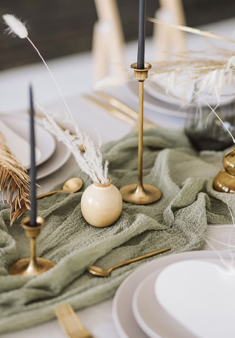
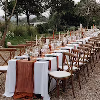
Sage green and terracotta, I just love this color combo! It seems yous do too!
So I get asked a lot to break down how I would style a certain color palette or color scheme.
I totally get it, finding the right colors to use and how to use them for a wedding can be hard.
I always held off on these sorts of blogs as annoying as it is to hear it really depends on so many factors.
I will style every wedding with this color scheme completely differently. But there would be some overall similarities.
So, here goes! Hopefully, this blog can answer this question and give you ideas and guides on styling a terracotta and sage green wedding.
Just looking for terracotta wedding color palettes?

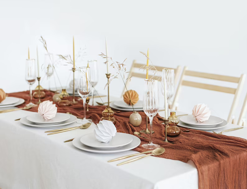
Sage Green and Terracotta color palette
Depending on your venue, wedding season, and overall style you can add other colors to adapt the look.
Most metals will work for an accent color, you can even use black for a modern feel.
The more white you use in your overall design the fresher and brighter the look will be.
You could use a darker sage green as your base and create a moody wedding color palette.

Ideas for styling a terracotta and sage green wedding

Stationery Ideas for a Sage green and terracotta wedding
If you are designing and creating your own wedding stationery then there can be a lot to consider.
- Firstly pick 2/3 fonts that you will use throughout the stationery.
- You need to choose the paper texture and colors
- The overall feel and look you want to create, this will be the first glimpse of your wedding
- A monogram or image can be a nice way to brand the stationery and day
You can see in this design board I went for a modern feel with a slight Scandi, boho vibe. I have this template set for sale in my Etsy store if this is your style.
Here are some more different ideas for terracotta and sage green wedding stationery.
Sage Green and terracotta Wedding Invites


Terracotta and Sage Green Wedding Flowers
Dried flowers lend themselves really well to this color palette. Using pampas and other dried grasses for the whites.
Greenery to add in the sage. You can then get some gorgeous terracotta-colored roses in fresh or silk.
Here are some ideas for different flowers you will need to consider for your wedding day
Bridal and bridesmaid bouquets


Centerpieces & large Installations


Table Styling for a terracotta and sage green wedding
For the design above, I would go for linen tablecloths to add a little natural texture.
I would use a mix of sage green and terracotta cheesecloth table runners.
Terracotta pieces as place names, copper cutlery, and a sage green menu.
You could use sage green tablecloths and white runners for a really fresh look.
Or if you want to make the look a little moodier or richer you could use terracotta tablecloths, velvet would be amazing for an autumn wedding.


- Emerald Green wedding color ideas for a stylish wedding
- Bridal Shower Schedule – Order of Events and Free Itinerary Template
- Mastering Your Bridal Shower Budget: A Complete Guide and Budgeting Tips
- I Spy Wedding Game Free Template and tips to creating your own
- Wedding Monogram, Logos for your Wedding Stationery – Free Template
- Emerald Green Bridesmaid Dress Ideas
Terracotta is a fall wedding color favorite and don’t get me wrong it is the perfect fall wedding color.
But it definitely isn’t just for fall!
In this post, I am going to show how you can have a terracotta color palette for any season and wedding style.
Because again, it isn’t just for a boho wedding!

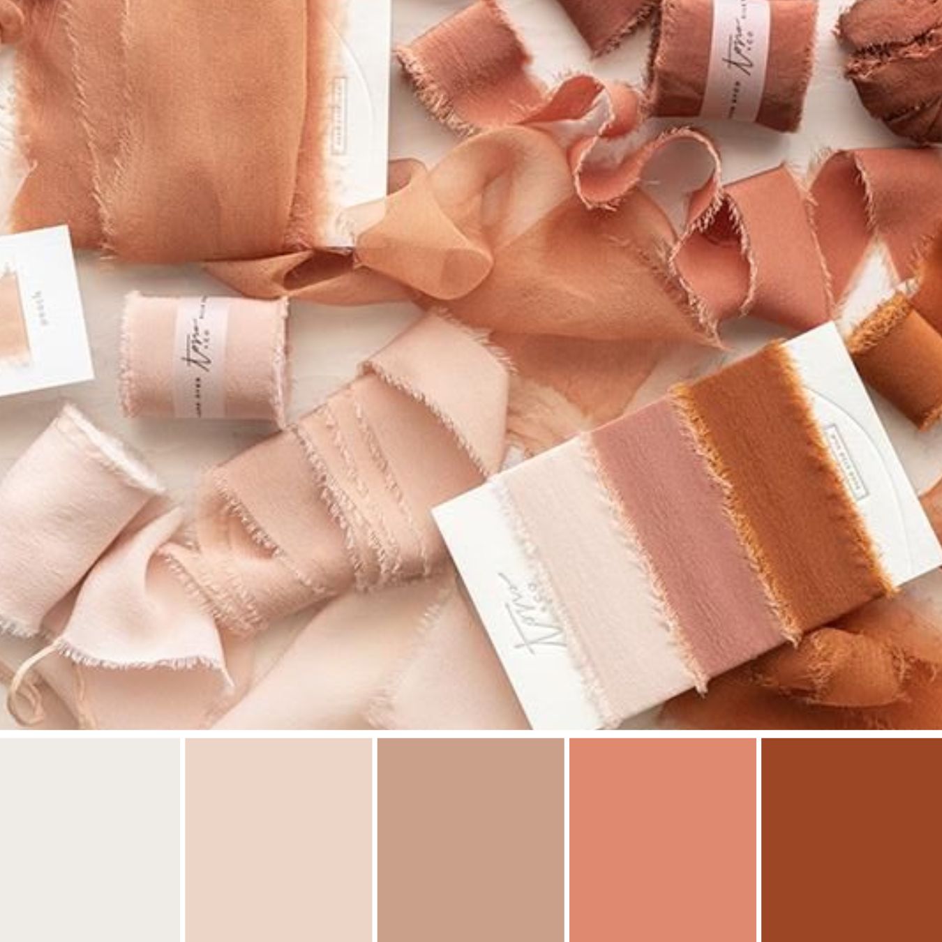
Terracotta Color
Terracotta is a warm and earthy color that takes its inspiration from the natural hues of fired clay.
It is named after the Italian word “terra cotta,” which translates to “baked earth.”
Terracotta is commonly described as a reddish-brown or orange-brown color, reminiscent of sunsets, desert landscapes, and rustic pottery.
As you can see above, with most colors terracotta comes in a wide range of shades. This is important to remember when talking to different suppliers, send them the shades you are using so you are all working from the same palette.
Top Tip – Zoey Louise
What colors go with terracotta for a wedding?
Depending on the overall style you want to achieve there are so many colors that pair well with terracotta’s rich, natural tones.
Here are some colors that work well with terracotta for a wedding:
- Neutrals: Neutrals like beige, cream, and ivory create a harmonious and understated wedding palette when combined with terracotta. They allow the terracotta color to stand out as the focal point while providing a balanced and calming feel.
- Warm tones: Colors in the warm spectrum, such as mustard yellow, burnt orange, and deep reds, complement terracotta beautifully. These colors create a cohesive and inviting palette, evoking a sense of warmth and comfort. Perfect for an autumn wedding.
- Earthy greens: Shades of green, particularly muted or olive greens, can create an appealing contrast with terracotta. These earthy greens bring a natural and organic feel to the color scheme, reminiscent of lush gardens or forests.
- Blues and teals: Cool blues and teals can provide a striking contrast to terracotta, creating a visually pleasing combination. The coolness of these colors offsets the warmth of the terracotta, adding depth and balance to the overall wedding color scheme.
- Metallic accents: Metallics like gold, brass, or copper can add a touch of luxury and elegance to a terracotta color scheme. These metallic accents can be incorporated as an accent color or used as a main color alongside terracotta.
Top Terracotta Wedding Color Schemes
Spring and Summer Terracotta Color Palettes
The best way to use terracotta for a spring or summer wedding is to pair it with softer and neutral colors.
Whites, creams, and champagne for a neutral base.
Then you can add in dusty pinks, greens, and even blues.
I have included on bright colorful wedding palette option which is perfect for a summer or spring wedding.

1. Terracotta and white
A timeless color palette choice. It can work with any wedding style.
Even though I am showing it as a spring/summer color it can work for any season.
Styling Tips
This palette lends itself to many different wedding styles. You can go boho with lots of pampas and white flowers.
You can go more minimal with crisp white tablecloths so key terracotta pieces, everything considered and paired back.

2. Elegant Wedding Style – Terracotta, cream, blush
Adding a soft blush color to your wedding color scheme is the perfect way to add a fresh spring or summer twist.
Styling Tips
I would keep things simple with the palette and go for an elegant wedding style.
Blush tablecloths and flowers. Lots of glass and candles, some terracotta decor pieces.

3. Color pop – terracotta, coral, pink, orange, and blue
How fun and modern are these colors together?
When I get a chance to style a colorful wedding I do get excited.
I am a minimal girl at heart but the fun you can have with color can’t be beaten.
Styling Tips
I would break the colors up and pick your base color or colors. Then which color(s) will be your main and then which will be used as an accent?
It stops you from just throwing all the colors everywhere and gives a cleaner modern look.

4. Terracotta and champagne
A match made in heaven! The shiny, smooth look of champagne really softens the earthy, rich tone of the terracotta.
This color scheme can work in any season, for spring and summer use more champagne and a lighter terracotta.
Styling Tips
For a spring or summer wedding, I would use terracotta more as an accent color.
Use a mix of champagne tones to build your base and maid colors and then pops of terracotta throughout.

5. For a modern wedding – terracotta, white and black
Now this may be one of my fave terracotta color schemes for a wedding.
I just think monochrome works with any main color for a clean modern look.
Styling Tips
I would have linen white tablecloths and softer terracotta linens and decor items.
Then black accents with the cutlery, decor items, and on the day stationery.
Fall and winter terracotta color schemes
Fall and winter are the time to have some fun and create some unique rich terracotta color schemes.
Any of the above colors will work but for a real moody, rich feel go for more earthy colors.
You can still create any style of wedding just play around with the colors and accents.

6. Sunset – A mix of rust, orange, peach
A melting pot of terracotta sunshine!
The best way to think about his palette is all the shades mixing and melting together to create all the golden sunset colors.
Styling Tips
This would work well in a rustic barn venue. Lots of wood, natural elements, and textures.
You can play with the amount of each shade to create a darker or lighter overall feel. I would say lots of candlelight and warm fairy lights.

7. Terracotta and rust
I love this color mix for an autumn wedding! Rich, earthy, and with the right lighting so romantic!
Styling Tips
Candles and fairy lights are your best friend with this palette.
You want to only use warm lighting, the fairy lights will add some romantic twinkle.
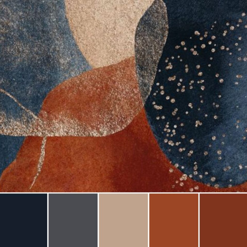
8. Terracotta and navy blue
I love that you can go really regal and a little vintage with this palette or really fun and modern.
This definitely the perfect way to use terracotta for a winter wedding!
Styling Tips
I would have rich, luxurious velvet navy tablecloths.
Lots of terracotta and rust and even maybe copper decor pieces. Of course lots of candlelight.

9. Terracotta and emarald green
Two of the most ‘it’ wedding colors right now!
I just love the romantic, rich earthy feel they give, It is definitely a more moody color palette, which I love!
Styling Tips
Lots of texture, when working with moody palettes I like to layer a lot and texture to soften the blocks of darker colors.

10. Terracotta and burgundy
I just love this palette, I mean how gorgeous are these colors together?
Please if you do your wedding in these colors send the pics over, dreamy!
Styling Tips
If you want to soften this moody palette a little add some blush in there also.
I love this palette though how it is for an autumn or winter wedding. Again, lots of textures, and different shades of each color.
11. Rustic wedding – terracotta and sage green
Did I just save the best to last? Possibly, this palette can work in any season.
I love the earthy tones while still being modern and fresh.
Styling Tips
This one I love so much it has its own design board and detailed bog on how to create this look.
I would use lots of natural elements like linen, wood, and of course real terracotta.
Keep things clean and fresh with some small rustic elements.
Head to my terracotta and sage green wedding styling blog for the full breakdown.
- Emerald Green wedding color ideas for a stylish wedding
- Bridal Shower Schedule – Order of Events and Free Itinerary Template
- Mastering Your Bridal Shower Budget: A Complete Guide and Budgeting Tips
- I Spy Wedding Game Free Template and tips to creating your own
- Wedding Monogram, Logos for your Wedding Stationery – Free Template
- Emerald Green Bridesmaid Dress Ideas
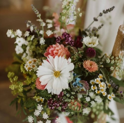
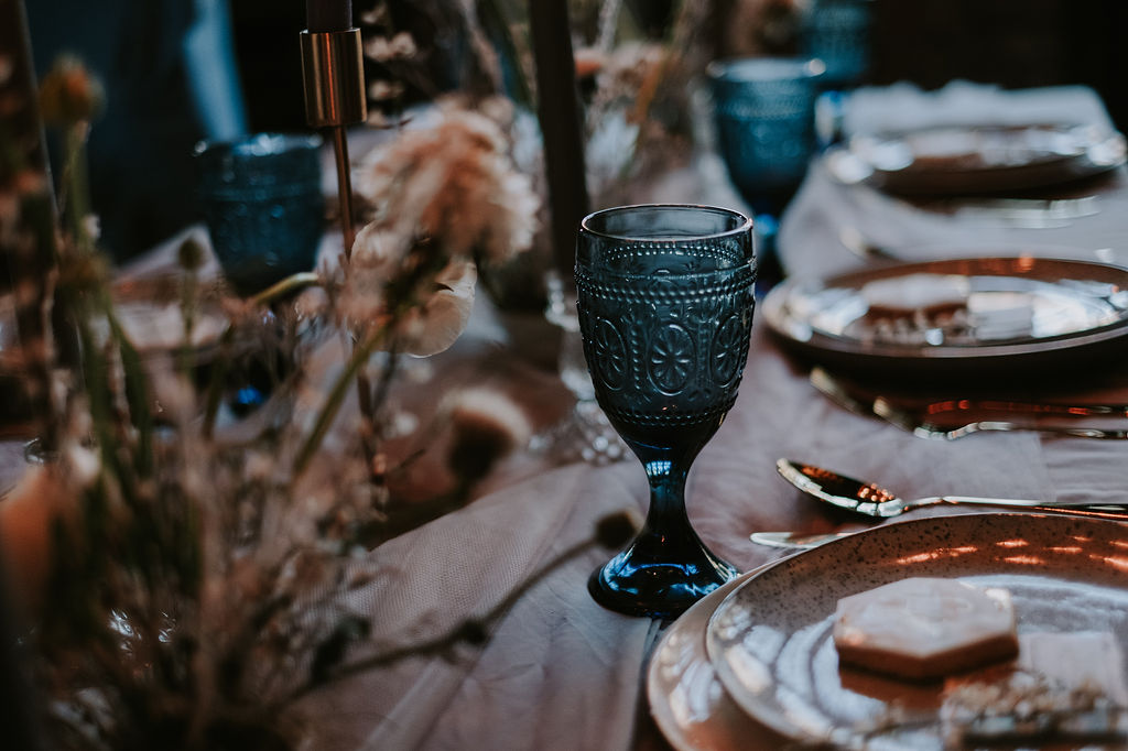
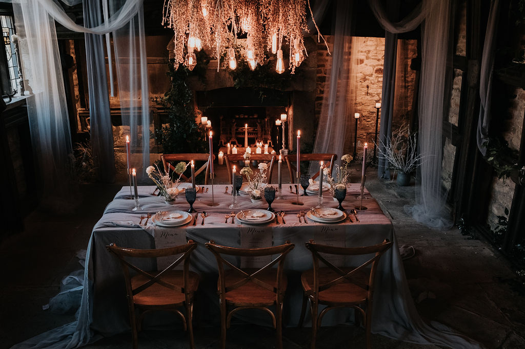
There is just something so romantic and dreamy about organic wildflowers.
Whether you are having an indoor or outdoor wedding and no matter the season the is a way to have a wildflower wedding theme.
So of course the easiest way to have a wildflower theme wedding is to use wild-grown flowers as your wedding flowers and bouquet.
If you want to fully embrace the wildflower wedding theme throughout your wedding design then there are lots of fun unique ways.

Wildflower wedding styles
You can really take the wildflower theme and adapt it to any wedding aesthetic.
- Rustic: Outdoor or barn wedding with lots of natural wood elements and loose wildflowers in jars and milk churns.
- Fine art: using the flower in unique structural designs. keeping everything else minimal and considered.
- Boho: festival vibes, think summer meadow. neutral color palette with lots of bud vase wildflowers.
- Moody: for the colder months go with deeper darker colors and add in some autumn or winter greenery.
Spring and summer wildflower weddings
I think of a spring wedding when I first think of a wildflower design. Maybe as all the flowers are starting to blossom and the colors are finally coming through. It can easily work as well for a summer wedding.
Autumn and winter wildflower weddings
I think people might think this theme can’t work in the winter months, but they would be so wrong! Think moody autumn garden vibes. Use darker colors and seasonal wildflowers.
Wildflower wedding ideas
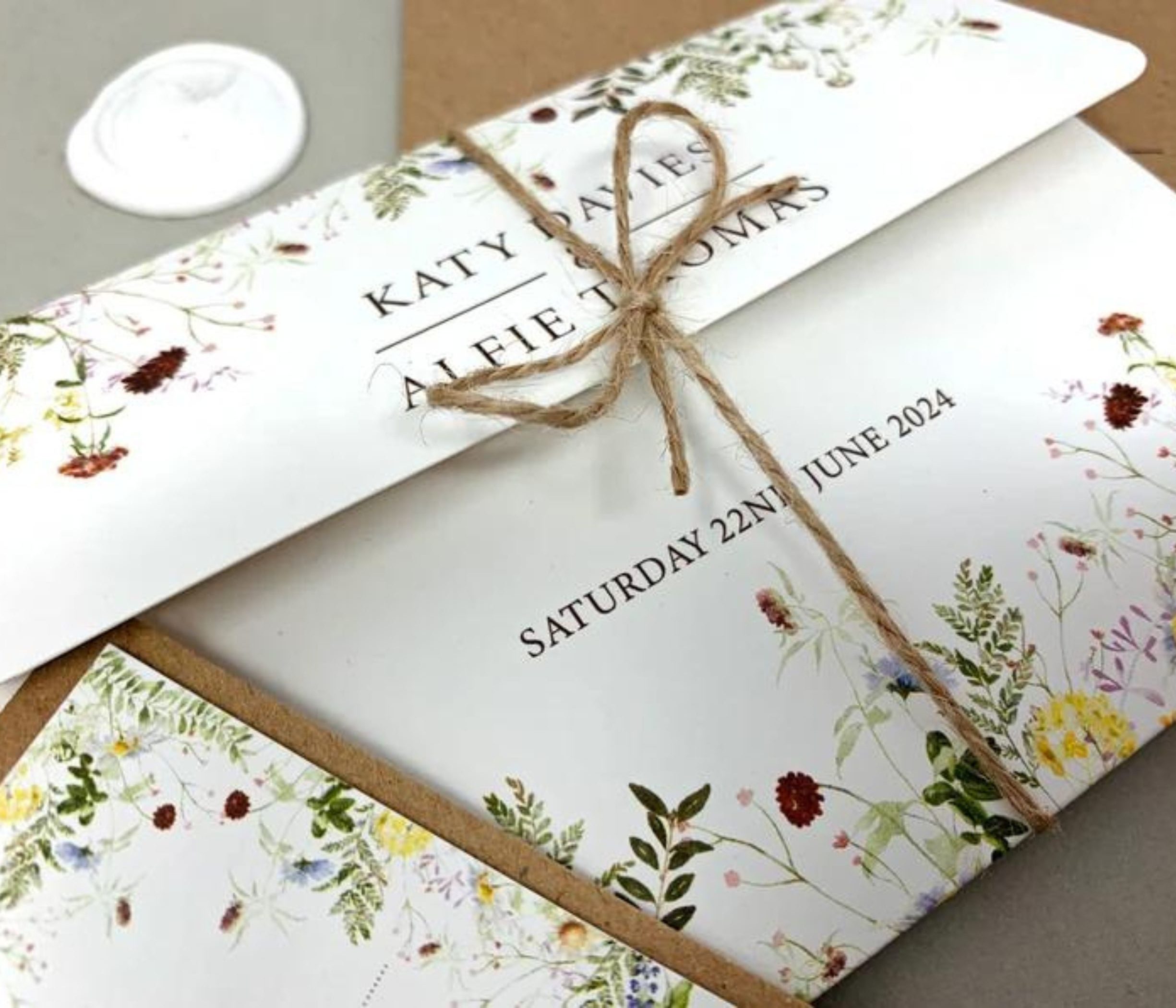
Wildflower invites
Having wildflowers growing from the bottom of the invites looks so pretty.
There are lots of designers who can hand draw this, and digitally design them.
Depending on your budget you can get some great templates on Etsy to edit and print yourself.
Another option is to have the invites printed on wildflower seeding paper.
You can then go for any design or style and it adds a touch of the wildflower theme. Your guest can then plant the paper and grow their own flowers!


Wildflower bouquets
If you want local wildflowers used in your bouquet then it is important to speak to your florist and make sure that is an option they offer. There are a lot of florists that grow their own or work with local smaller flower farmers so there will definitely be someone near you.


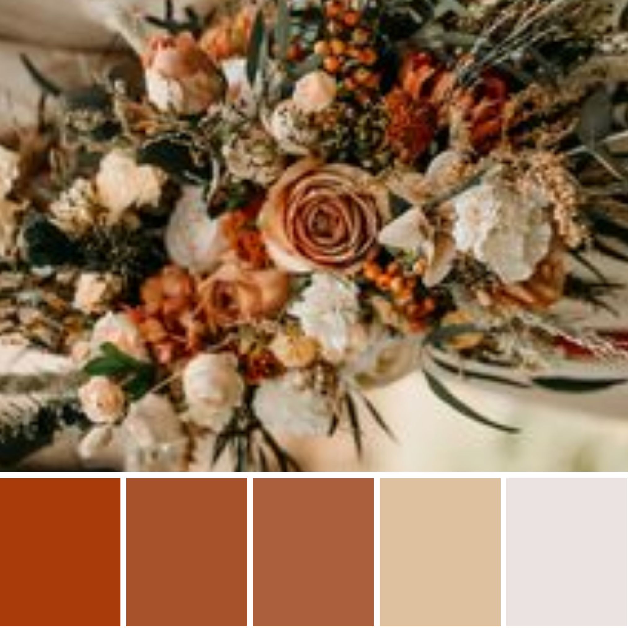
Faux and preserved wildflower bouquets
Faux and preserved flowers have come such a long way in the last few years. You can source all the flowers and make them yourselves as a fun DIY project. There are lots of premade and made to order options on Etsy and elsewhere to choose from that are so stunning and well-made.
You can go for dried flowers which will have a crispier feel and muted colors. Preserved flowers look and feel like fresh flowers. Also, real touch and high quality faux flowers are very realistic these days.


Wildflower Ceremony flower ideas
I think the number one way to have a wildflower wedding ceremony theme is a growing meadow aisle. Low level flowers with no base showing full of dreamy wildflowers. This isn’t cheap though, and if it isn’t in your budget there are other ways to create a similar style for less.
A good way is to have low level centerpiece florals and use them on the aisle also. Another way is lots of vases filled with wildflowers. You can add lanterns so fewer flowers are needed.
If you are wanting something more low key then a nice arch with a wildflower display always looks stunning. Or keep it super simple with just some vases or flower displays on the ceremony table.


Wildflower centerpiece ideas
I think bud vases filled with flowers and taper candles are always a winner! You can do a nice wildflower display with a few candles. Or I am in love with these lanterns with pressed flowers attached, how dreamy!


Wildflower wedding cake ideas
Again I think one cake always comes to mind when I think about wildflower cake ideas! A pressed flower cake is so on trend right now and swoon every time I see one! Or you can keep it simple, all white and some sugar flowers.
Wildflower wedding favors
So giving your guest wildflower seeds in a cute way is definitely a great way to carry on the wildflower theme. You can do candles, biscuits, or many different things with a wildflower touch.
Or make the place names or menus out of plantable paper and then they can take them home and plant their own wildflowers.


MORE BLOGS YOU WILL LOVE


Burnt orange is the new kid on the block and taking the wedding world by storm!
Even just a few years ago if you told someone you were having an orange wedding, the looks you would get!
Burnt orange when done right is one of the best wedding colors for an autumn wedding.
What I love about burnt orange is you can pair it with creams, and softer oranges for a romantic look.
Or go all out with an autumnal mixed color palette with dark green, mustard, and deep berry reds.
What colors go with burnt orange for a wedding?
Depending on your wedding style you have lots of color choices to pair with burnt orange. You can use a complementary color like blue, a deep dark blue works well for a moody palette, a dusty blue for a lighter feel, or a vibrant stand-out palette with a light bright blue.
Here are some of my favorite color schemes for a burnt orange wedding theme in 2023.

1. Burnt orange, terracotta, and white
The terracotta and white pair so well with burnt orange and give a fresher feel. You could add some pops of black for a modern feel.
Burnt orange is always great in autumn but with the creams this palette with work well in all months even summer.
Styling Tips
This palette lends itself to a modern scandi boho style wedding. Lots of natural textures and materials. Use Terracotta, clay, and other natural stones. I would use dried white and cream flowers and grasses.
Think bohemian desert vibes. Dried grasses, texture, and mixed creams.

2. Autumn mixed color scheme
Burnt orange, mustard yellow, dark green, and deep berry reds. The perfect autumn or winter color palette. I feel like it is celebrating all the beautiful autumn colors that come out in the fall.
Styling Tips
I would go bold with dark green tablecloths, and velvet for that extra luxury. Then have the burnt orange and yellow come through in the flowers and decor. Copper would make a great accent color for extra decor pieces and cutlery.

3. Burnt orange and Teal
A rich combination made in autumn heaven. Both colors are bold and it might seem scary to pair them but when done right it is stunning.
Styling tips
I would use copper accents to add even more richness. I would use teal in fabrics and decor and then burnt orange mainly in the flowers. Then finish it off with pops of copper with cutlery, votives, and even charger plates.
4. Burnt orange, rust, and black
Now, this color palette is a bit of me! It has to be matt black or charcoal black. Think very urban, edgy making a bold statement.
Styling Tips
I would go with mainly matt black, for everything. Use it for tablecloths, crockery, and cutlery but layer and add texture where needed. The small pops of rust and burnt orange in the flowers and finishing touches.

5. Burnt orange, dusty blue, and copper
I love dusty blue and apart from navy blue, it is the best blue to pair with burnt orange.
Styling Tips
I would have rustic wooden tables and dusty blue chiffon runners. Then burnt orange in the flowers and lots of copper finishing touches.

6. Burnt orange, rust, and tan
For me, I am thinking of very earthy, natural vibes with these colors.
Styling tips
Now I actually wouldn’t go boho with this color palette. I think you can pull off a very high natural feel here. The base color is tan and used throughout, with black as an accent but used minimal. Keep everything minimal and carefully curated. Dried flowers in a mix of all colors, textured rust decor, and candle holders.

7. Burnt orange and olive green
Using burnt orange is a unique way to use the ever so popular sage green. Sage green is usually also a summer or spring color so it is a good way to make it more suited to autumn or winter.
Styling Tips
As always I would mix the shades used but I would really focus on this here. Adding in darker shaded of green and lighter shades of orange. You can have lots of fun here and use more light or dark depending on the season.

8. Burgundy and burnt orange
Love these two together and they work so well with lots of different colors depending on the style you want to achieve. Add in some soft neutral whites and cream to soften the palette or go even bolder with emerald green.

9. Burnt orange and sage green
Sage green was definitely the color of 2022 and I see it being just as popular in 2023 and beyond. It is a lovely grey-green color. It pairs perfectly with burnt orange and rich orange for a moody color palette.
Styling Tips
I would do burnt and dark orange in the fabrics and flowers, lighter soft greenery, and then some pops of sage green in the candles, maybe glassware and stationery.

10. All the oranges
Why not just go all out and have all the rich, deep, and dark sunset oranges you can? The beauty of this palette is you can go lighter or darker depending on the style or season of the wedding.

11. burnt orange and pink
There is just something fun about ink and orange together. If yu are looking for a fun, colorful palette for a bright and bold wedding, this is for you!

12. Burnt orange and emerald green
A match made in heaven! The two hottest autumn wedding colors mixed into one scrumptious autumn color palette.
Love emerald green? Head here for the best emerald green color palette ideas.

13. Deep dark reds with burnt orange
This one is giving me all the fallen autumn leave vibes! A melting pot of all he beautiful colors that come to mind when you think of fall.
Burnt orange wedding ideas
- Emerald Green wedding color ideas for a stylish wedding
- Bridal Shower Schedule – Order of Events and Free Itinerary Template
- Mastering Your Bridal Shower Budget: A Complete Guide and Budgeting Tips
- I Spy Wedding Game Free Template and tips to creating your own
- Wedding Monogram, Logos for your Wedding Stationery – Free Template
- Emerald Green Bridesmaid Dress Ideas
