Wedding and events
Emerald green is the perfect wedding color. With the right palette, it can work for any season but especially lends itself to a winter or autumn wedding.
If you are looking for a rich wedding color that is versatile, emerald green is for you.
It works with so many colors to create a palette for any wedding style or season.
Stick around as I have put together the most must-have 2023 emerald green wedding color palettes.
Or head to the bottom of the blog for all my favorite emerald green wedding ideas.

What colors go with emerald green for a wedding?
So many! This is probably not the answer you were looking for but so many colors really do.
Head to my emerald green color blog for the full breakdown of the color and its compliments, analogous, and triad.
Here though are some of the best color combos that go with emerald green for a wedding or event.

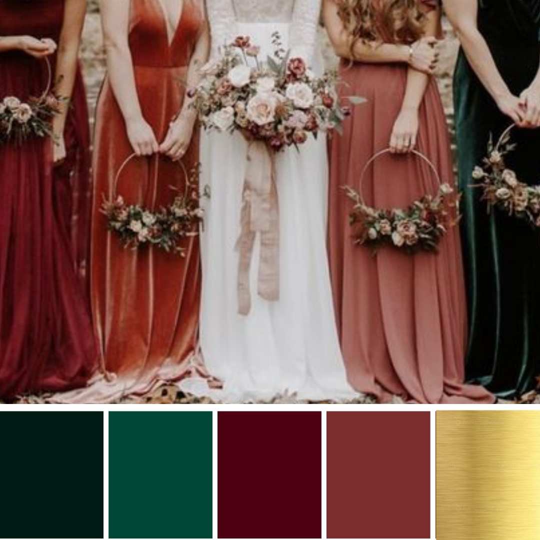
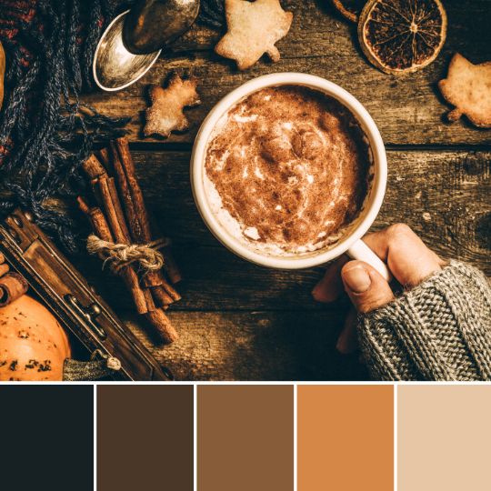
1. Emerald green, burnt Orange, and copper
This is an autumn wedding color palette of dreams. The deep rich colors of both emerald and burnt orange add so much depth and drama.
Here I’ve used copper as an accent color to keep with the rich palette. You can easily swap this with another metal, also consider black for a stylish twist or white to add some freshness and make it work for warmer months.

SHOP ALL THE ITEMS ON AMAZON NOW!
Styling tips
Have emerald green tablecloths for a dramatic look. Bring in the burnt orange through the florals, mixed in green foliage.
Then the copper can be mixed in with your cutlery, candle sticks, and votives. Use emerald candles to finish the look.

2. A pop of pink
I just love this fun color palette! It is a modern take on a pink wedding. The darker rich green gives a stylish modern feel while the muted pink adds a fun pop of color.
This palette will work in any season, for summer weddings add more light greens and a higher ratio of pinks.

Styling tips
Depending on the overall feel you want to achieve I would mix up the ratios of pink to green. Green tablecloths with pops of pink in the florals and candles would look so modern and fun!
You could also go for soft pink tablecloths for a summer wedding and add pops of green and pink with the flowers, candles, and glassware.

3. Emerald green Gold and white
This color scheme is so elegant and timeless. It works in all seasons but is the perfect winter wedding color palette. You can add in some shades of dusty pink or blue for a summer or spring wedding.

Styling tips
I feel this palette works well with a simple, elegant wedding style. Keep the design paired back but include simple but beautiful carefully selected pieces.
White line tablecloths with emerald green runners, I would use velvet in the winter and soft gauze in the summer. Clean modern gold candle sticks and holders, for some luxury use gold cutlery and gold rim glassware. Adds some glass items also to reflect and add a little romantic twinkle.

4. Moody Greens
If like me you love a moody palette then this is the emerald green wedding color scheme for you! Perfect for a winter wedding for a moody modern feel.

Styling tips
Darker color palettes can be harder to achieve with weddings, work with your venue carefully. Dark green tablecloths, lots of glassware, and black and emerald green candles. When going for a darker palette you need to also include lighting options. Lighting can change it from dark and dingy to warm and romantic. Lots of fairy lights, candlelight, and Edison bulbs for a vintage feel.

5. Rust and emerald
Green and rust colors just make me think of aging copper, the colors beautifully mixing together. I wanted to keep this palette fresh, normally rust emerald green schemes would be richer. This palette will work for any season.

6. Jewel tones
If you are looking for a colorful winter or fall color scheme then jewel tones are the way to go! Add an accent of copper and you have a colorful yet stylish wedding.
Styling tip
Keep to 5/6 colors max, with all the colors a jewel tone. Pick a base color like emerald green to use throughout and then add the others in pops through the flowers or candles.

7. Mustard yellow and emerald green
I love mustard and dark blue, but I think I may just love it with emerald green more! What a color combo, it is a great modern take on blue and yellow palettes.
Styling tips
Depending on your wedding season you will want to go darker or lighter with your shades. Just because I am in love with emerald velvet I would use these as tablecloths. Then I would have yellow and warm-tone flowers, and a few candles but keep it really clean and minimal as the colors will be doing enough. If you wanted to soften the green you could include a dark cream/brown gauze runner.

8. Bright greens
Adding some lighter greens like mint to the emerald green gives you a fun light all-green color palette. You can easily add some pinks, blues, or purples to this palette for a fresh colorful wedding scheme.
Styling Tips
I would have lots of greenery, all the different shades I could find! Green tablecloths, in a lighter shade. Then lots of glass and mixed green tone candles. Layer the colors and texture to add interest. You could have a few different textured runners. I would use apples, limes, succulents, and even moss. Adding interest and detail really helps when styling a monochromatic color scheme.

9. Navy and emerald green
Maybe not two colors you would put together at first thought. I think they work beautifully together though. The navy brings out the blue tones in the emerald and helps the green pop more. Adding in some lighter blues makes it adaptable to an all-year-round color palette.

10. Freshness in a color palette
The green with the grey is so clean and fresh feeling. It is a timeless color palette and perfect for a minimal or modern wedding vibe.
Styling tips
Keep to simply clean lines, and keep styling minimal. Use texture in the fabrics to soften and merge the colors but the contrast is the beauty of the palette so play on it.

11. Muted purples and emerald green
I just love the muted purple mix with the rich emerald. I do keep saying but the perfect winter color palette.
Styling tips
Go full-on decedent with this color palette! I love a minimal look but you can go all-out maximalist with this palette. Grapes, berries, and figs added to an audience of flowers. Deep dark tablecloths with an emerald runner. Layers and texture or if bold enough a patterned floral tablecloth with all the beautiful colors used.

12. Dusty blue and dark green
So I am a big lover of dusty blue, dusty blue and copper is one of my top color combos. Mixing it with emerald green though is a must! With the blue tones of emerald green, it looks like a melting pot of gorgeousness.
Styling tips
This palette plays perfectly for a romantic whimsical wedding. Lots of soft fabrics, layers, and glass, used in the decor. Depending on the season use more of one color, emerald for the colder months and dusty blue for summer.

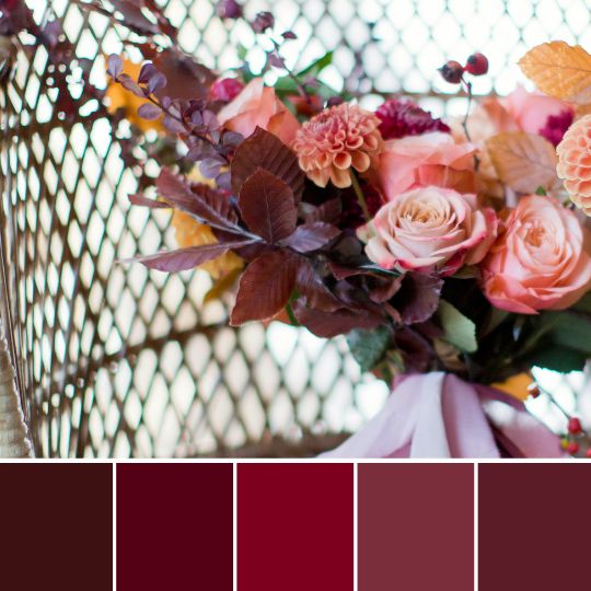
13. Mulled wine vibes
The deep rich reds of this palette make me think of mulled wine. I think this is the perfect festive color plate for a modern take on festive colors.
Styling tips
Choose your greenery carefully, even if getting married around Christmas you don’t want your wedding to look like a Christmas party. Stick with non-Christmas greens, Ruscus and eucalyptus or olive branches are a perfect choice. Lots of lush greenery, bring the burgundy in through candles and decor.

Emerald green wedding ideas you will love!
Depending on your wedding theme you can include emerald green in so many ways to your wedding.
1. Use lots of greenery in your flowers
Lots of greenery is the easiest way to have an emerald green wedding. Make sure you choose darker greenery types for an emerald green look.


2. Candles are a great way to add emerald green to your decor
I do love a colored candle! It is a cheap and easy way to add a pop of your chosen color to your wedding styling. Especially your table styling.


3. Velvet tablecloth or runner
Green velvet is just so rich and dreamy. If you have it in your budget then go all out with every table. If you looking to make an impact on a tighter budget then table runners work well. You can also just use it for your cake table, which adds some texture and drama.


4. Have an emerald green wedding dress
This one is for the bolder brides! Emerald is such a flattering color for most skin. If you are more of a nontraditional bride and want something unique then looking for colored wedding dresses is a good idea.

5. Wear a pair of emerald green shoes
I love this idea, it is a fun way to add a pop of emerald green to your wedding outfit.


6. Groom and groomsmen suits
Colored groom suits are so popular and I am totally here for it! I think a dark green suit might be my favorite groomsman color choice.

7. Dress your bridal party in emerald green
As I mentioned above it suits so many skin and hair types that it is the perfect green choice for your bridal party. As a darker shade of green, it gives a stylish feel.


8. Have a green wedding ring
There are so many stunning unique engagement and wedding bands available now. I suggest heading to Etsy, you are sure to find the perfect emerald green band.

9. Set the tone with invitations
The invites are the first thing your guests will see so I think it is important to set the tone. Using your wedding colors can also be helpful for guests to get a feel of the color and style of the day.

10. Have an emerald wedding cake
Cake should always be a showstopper. But a bold, dramatic emerald green cake really can’t be beaten.


Emerald green wedding color ideas
I hope this blog has helped you find your perfect emerald-green color palette. First, think about your season, and how you want your day to feel and look, then pick a palette that works with these answers and your venue. If you have any questions leave a comment below!
- Mastering Your Bridal Shower Budget: A Complete Guide and Budgeting Tips

- I Spy Wedding Game Free Template and tips to creating your own

- Wedding Monogram, Logos for your Wedding Stationery – Free Template

- Emerald Green Bridesmaid Dress Ideas

- Top 2024 wedding styles for an aesthetic vibe and how to create them!

- The Hottest Sage Green Wedding Ideas for Every Season and Style

Colour palette for a wedding or event
This one is a biggy! I am bringing you the ultimate guide to creating a color palette for a wedding or event.
Now, this is aimed at those wanting to really dig deep into colors. It goes in-depth, we chat about color theory and phycology and working with colors from a design perspective. Head to my quick 5 step process if you just don’t have time for all the faff! If you are a geek like me then carry on reading for the deep dive!
I also share different palette options and how to use them for events. If you are a bride or groom looking for advice on color palettes or a wedding supplier, or a creative business looking to learn more this is the blog for you!
If you prefer to print/download and read later grab the printable version. Full of extra information and some templates.
I believe having an understanding of color, how they work together and the feeling they can create is a must for any designer. Most creatives in the wedding industry will have elements of design in their work. Cake makers, florists, planners, and of course stylists and designers. This guide will help those wanting to get into event design but also any creative wanting to understand color palettes and how to work with colors.
Colour terminology
So I throw some words around in this blog and it is not imperative you learn them but having an understanding will help you with your color knowledge. Like most, I am still guilty of saying what a lovely shade of blue!
Really shade? That is a tint actually!
This is not something we hear often, never in my case, so don’t get caught up with the terminology but they are useful.
Also, when working with other designers, especially stationers it is good to be able to communicate clearly. Knowing the right terms will help.
- Hue: Pure color, primary colors, or a non-mixed color. Not black, grey, or white.
- Tint: Adding white to the hue. Lightening the color, not brightening even though it may appear so, it is a paler version of the color.
- Tone: Adding grey to the hue. Truetone is only adding grey, no other pigments. A pure mix of white and black. Think muted, moody colors in the wedding world!
- Shade: Adding black to the hue.
- Neutral: Hues that appear to be without color. The main neutrals are black, white, brown, and grey. All other neutrals have a hue undertone but are called neutrals by most.
- Analogous: Sit next to each other on the color wheel.
- Complimentary: opposite colors on the color wheel.
- Split-complimentary: The two colors on either side of the opposite
What is color?
Colour is the term we use to describe every hue, tint, tone, and shade we see.
Colour is relative! An object appears colored because of the way it interacts with light. We perceive color through vision, light, and individual interpretation and understanding.
This is important to remember when working with clients or others in general. If I say to you the color blue, each one of you will picture a different color in your head, a slightly different shade or tint of what we would consider true blue. Even with added description. dusty, pale, dark blue we will all picture a different color.
With the digital world, we can create unimaginable amounts of colors. A lot can’t be recreated in the natural world so easily. That is why it is important to work with a mix of shades, tints, and tones when creating an event color palette.
Ask for pictures, and swatches, and share the colors in different formats for clients so they understand a true reflection of the color palette.
Even in digital form, a color may look different not just to someone else because of perception. Screen lighting and setting will affect the look.
A good example is that dress that went around and how people saw two different color sets! Crazy that we can look at the same colors at the same time but see them differently.
We also feel different when looking at colors, which we will discuss next in color phycology.
Color phycology
Color psychology is the study of how colors affect human emotions and behaviors. Each color has a different meaning and feeling that it is associated with.
Some examples of colors and their meanings are listed below:
• Blue is often thought to be calming and soothing. It can be used to create a sense of trust and security.
• Green is associated with health and nature. It can be used to create a sense of balance and harmony.
• Orange is associated with happiness and vibrancy. It can be used to create a fun and festive atmosphere.
• Red is associated with passion and excitement. It can be used to create a sense of energy and urgency.
Colour Theory
Primary colors & secondary colors. In the traditional sense, Red, blue and yellow are our primary colors and we use these mixed with each other to make our secondary colors and tertiary colors, and all the rest.
Tertiary colors are double colors if you like, blue-green, red-purple, etc.
In the digital world, things get more complicated. We work within RGB and CMYK and the primary colors are cyan, magenta, and yellow. This is because we are working with light and inks for printing.
Without going into too much depth here I just wanted to mention this. It is something to be aware of especially when working with different suppliers. A graphic designer over hand-painted stationer. Also, cake makers will mix their fondant colors in a traditional sense of colors.
It also affects the color wheel and how we see compliment and analogous colors. We discuss more by looking at the traditional and modern color wheels.
Colour Wheel
Traditional and modern color wheels. Digital primary colors are different from traditional colors. Because the colors are used by light rather than mixing of colors like traditionally. It is all beautiful maths but I won’t go into all that here!
I just wanted to explain as the wheel and its contrast and compliments are slightly different.
Traditional color wheel
Red, blue and yellow are the primary colors. Orange, green, and purple are the secondary colors.
The tertiary colors are double colors: red-orange, yellow-orange, yellow-green, blue-green, blue-purple, and red-purple.
The color wheel can be split into warm colors (reds, oranges, and yellows) and cool colors (greens, blues, and purples). Warm colors are associated with fire and energy. Cool colors are often thought of as calming and soothing.
Colors that are opposite each other on the color wheel are called complementary colors. For example, blue and orange are complementary colors. When used together, they can create a striking contrast.
Analogous colors are colors that are next to each other on the color wheel. For example, blue, blue-green, and green are analogous colors.
When used together, they can create a harmonious and soothing effect.
The color wheel can also be divided into four quadrants: primary colors (red, yellow, and blue), secondary colors (orange, green, and purple), tertiary colors (red-orange, yellow-orange, yellow-green, blue-green, blue-purple, and red-purple), and neutrals (black, white, and gray).
Primary colors are the most important colors because they cannot be created by mixing other colors together. They are the building blocks of all other colors in the traditional color wheel.
Modern color wheel
The modern color wheel is slightly different from the traditional color wheel. The primary colors are cyan, magenta, and yellow. These are the colors used by light rather than pigment.
The secondary colors are red, green, and blue. The tertiary colors are double colors: cyan-blue, magenta-red, yellow-green, etc.
As with the traditional color wheel, the modern color wheel can be divided into warm and cool colors. However, because of the difference in primary colors, the division between warm and cool is not as clear-cut as it is in the traditional color wheel.
Colors that are opposite each other on the color wheel are still called complementary colors. However, because the primary colors are different, the complementary colors are also different. For example, cyan and red are complementary colors.
Analogous colors are still colors that are next to each other on the color wheel. However, because the primary colors are different, the analogous colors are also different. For example, blue, blue-green, and green are still analogous colors.
The color wheel can still be divided into four quadrants: primary colors (cyan, magenta, and yellow), secondary colors (red, green, and blue), and tertiary colors (cyan-blue, magenta-red, yellow-green), and neutrals (black, white, and gray).
The main difference between the two wheels is that with the modern color wheel the color combinations increase and with this there is an audience of colors that can be created.
Hues, Tints, shades, and tones
Hue is the name of a color on the color wheel. For example, blue is a hue. The tint is a hue to which white has been added. For example, light blue is a tint of blue. Shade is a hue to which black has been added. For example, navy blue is a shade of blue. The tone is a hue to which both black and white have been added. This makes the color less intense and more muted. For example, pale blue is a tone of blue.
Value is the measure of how light or dark a color is. A color can be made lighter by adding white (this is called a tint) or darker by adding black (this is called a shade).
The value of a color can also be changed by making it more or less intense. This is done by adding a color that is opposite it on the color wheel (this is called a tone). For example, orange can be made more intense by adding red or less intense by adding yellow.
The value of a color is important because it affects how easy it is to see. For example, light colors are easier to see than dark colors.
Saturation is the measure of how pure a color is. A color can be made more saturated by adding another hue that is similar to it on the color wheel or less saturated by adding a neutral (black
Choosing your color palette or color scheme
So I have given so much theory and rules around color! I have done this as I do believe knowledge is power! Having a good understanding of colors and how they work together means you can experiment and be adventurous!
I also believe in throwing out the rule book and being a rebel! As mentioned before color is relative! If you love a palette, or your couple loves it and it works for the space then go for it!
I think having the underlining knowledge though can help give you the confidence to do this and also the skill to make it work and look amazing.
Here I will share popular color schemes and ways of mixing colors together. Again to give ideas and inspiration.
Contrast with colors
Again this is a big subject and we will briefly touch on it here as it is an important factor when creating a color palette. Contrast is how the color stands apart from another color or colors.
High contrast, easily stands out. Low contrast, neither stands out over the other. A too low contract can lead to a flat dull palette, while too high can lead to a harsh overwhelming color scheme.
It is not all about the color choice. You need to consider the tone of the colors, and how much grey is added. If very similar in all colors you will have no contrast. I usually always have at least one contrasting color in my wedding palettes. This may be the accent or maybe be a tint, shade, or tone within the main color scheme.
It is all about balance and depending on the overall feel on how much or little contrast you add. Playing with a mix of analogous and complementary colors and adapting and using a mix of tones, shades, and tints of the colors.
Using a complementary color scheme
This color scheme uses colors that are the opposite of each other on the color wheel. This can create a very bold and striking look for your wedding.
I would recommend using one or two complimentary colors with a base of more neutral tones. To break up the harshness you can use tints, shades, or tones of the complementary or main colors.
Head to my best complimentary color palettes blog for lots of ideas like this one!
Split complementary colour palette
If you want to use a complementary color scheme but feel it may be too harsh then this is a great alternative. You take one main color and then the two colors on either side of its complement. This gives you a softer palette while still having that wow factor.
Head over to my best split complementary color palettes blog for some inspo!
Creating an analogous color palette
Analogous colors are colors that sit next to each other on the color wheel. This can create a very harmonious and calming feel for your wedding.
You can use a mix of all colors within this scheme or pick one or two as your main colors and base the palette around these. Again using tints, shades, or tones of these colors helps break up the colors and stops them from being too ‘matchy matchy’
Using a monochromatic color scheme
All the tones, tints, and shades are within one hue color. This is usually how I work with my wedding palettes for the base and main color. You can add so much depth, interest, and even contrast using just the shades, tints, and tones of one color.
If you are new to working with colors monochromatic is the best place to start. You can then start to add contrasting tints or play with an accent color to see how it affects the overall feel and look.
Then take two colors or a tertiary color and get creative building color schemes with different shades, tints, and tones that fall within the two of them. I like to think of it as both colors merging together slowly and all the mix of tones, shades, and tints that make it up.
A good way to start is to have a play on Canva or if you have an Adobe program. Pick your main color and select the color picker box and move the picker around. Every single color in that box is a shade, tint, or tone of your color. You can see how much variety there is and how you can make a color palette full of depth, interest, and contrast just using a monochromatic color palette.
Neutral colors
For event design palettes neutrals are used slightly differently. The main reason is we are usually working with flowers and nature.
Also, certain colors can work as a neutral for the palette but may not be neutral in the true sense. i.e. certain greens. They are used in a similar way in interior design. It is neutral with a hue undertone.
I like to think of them as having no impact.
They compliment all the other colors so well and in equal measure, that it has no effect. There is no contrast provided. It works as a great base to build on. I usually pick neutral colors based on the venue or area we are setting up. As it not only needs to be neutral to your colors it also needs to work with its surrounding. Done well it can be the perfect merge of the surroundings and the chosen color palette.
My wedding and event color palette process
I follow a similar process for most weddings and events. I break my color palette up into 3 parts. I have my base-neutral color, my main color(s), and the accent color.
Even if working with a mixture of colors I will break my palettes up this way. Remember what we spoke about before, if you have the same tone in all your colors they mold well together and no contrast is created.
So in a way you can still bunch as one color when working with this method. Of course, they are not but they have no real effect on each other and any added colors neutral or accent will have the same effect on them equally.
Base color –
The base color is your neutral color. It will take up 70% to 80% of your design.
It doesn’t have to be white, black, brown, or grey. I do use grey a lot as a base though. There tends to be an overuse of bright white as a base color in weddings, it is usually in its purest form. This creates contrast from the start, which is not wanted for most designs.
Softening the hue slightly or adding a slight undertone can make all the difference to the overall feel. Think taupe, grey-white, and stone colors.
As previously mentioned neutrals don’t need to be pure neutral colors. It is about finding a color that works well with your main colors and accent to achieve the desired feel. You can take a Palette from light and airy to moody and dark with a swap of a base color. You can play with tones, shades, and tints of your chosen palette to manipulate the outcome.
Playing with your neutral against your main color can make the color pop or calm it down and neutralize.
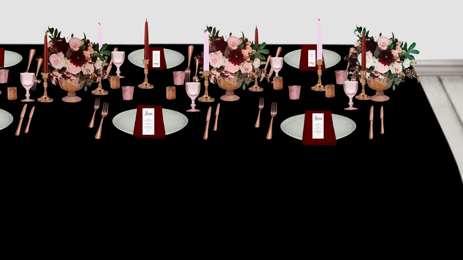
Below are some renders. I have changed only the tablecloth color. This is in the simplest sense to show you the effect of changing or choosing your base neutral. Of course, other elements would change in the design with a real wedding.
With the white and black the colors still pop. They are the colors in their purest form. I personally would use a softer black or white and the white is toned down slightly.
With the grey, you see how the darker red pops while the toned-down reds, the pinks, are more subtle. The copper also has some contrast, more than the lighter red.
With the pink undertone neutral, ideally, I wanted less pink, this is white with a really light red undertone. Hard to achieve with this render. Again, the darker reds pop, and the toned-down lighter reds are softer on the eye.
Also, look at each picture and think about the feeling you have. The black adds a moody modern vides and with the copper contrast high adds a warm feel. The grey for me really neutralizes the whole feel and makes it feel romantic and soft. The white adds freshness and vibrancy to me. The pink I feel works similar to the grey, with a soft relaxed feel and more understated look.
These are of course digital mock-ups but I hope they help you understand the effect of your base on your main colors and the role it plays to create the overall feel for the day.


Main color
This is where monochromatic comes in. Sometimes I do this with the base also or instead but for the majority of palettes and for simplicity I will talk about it as the main colors only.
As mentioned monochromatic is all the shades, tints, and tones within a hue/color. You can really play with this depending on the color you choose, you can have a vast range. Take Burgundy, which is a mix of red, brown, and a tint of purple. If you work with burgundy as the main color and look at all the shades, tints, and tones then you will see you can range all the way from red to purple.
I also sometimes use a set of 3 analogous colors mixing their shades, tones, and tints so they melt beautifully together. I love to use just the right amount so it is as if you can’t fully tell where one color ends and another begins.
The best way to learn is to set up the picker and have a play. Here I have 4 monochromatic color palettes. No base or accent. I have done pink, blue, red, and purple. I have shown my chosen color and its code and then picked a palette using the color picker on Canva.
Have a look yourself and have a play and see what palettes you can create. Playing with colors is the best way to learn and grow your understanding.
Accent color
This is usually a metal; gold, copper, brass, or silver. It doesn’t have to be though, it can be a color also. I often use black as an accent color and it is a great modern accent that adds some wow while keeping it elegant.
Look at your colors, venue, and style, and think about what will work best. If you have a period venue and going for a timeless design then brass would work perfectly, think vintage brass candle sticks running down the tables. If you wanted it to look a little more modern then swapping to gold and simpler candlestick it would change the feel while still suiting the venue.
Wedding color palette and color schemes
Even though there is a lot of information in this blog it really does only touch the surface of colors and learning how to use them. I have repeated this but the best way is to practice, and try out color palettes. Have fun, experiment, and enjoy the learning. If you have any questions reach out to me.
Fall is one of the most popular seasons for weddings, and it’s easy to see why. The cooler temperatures make for more comfortable guests, and the rich colors of the season provide a beautiful backdrop for photos.
If you’re planning a November wedding, you might be wondering what color palette to choose. To help you out, we’ve put together a list of 9 color palettes perfect for a November autumn wedding. From rich jewel tones to muted earth tones, there’s sure to be a palette that will fit your vision.
So whether you’re looking for something dramatic or something more subdued, read on for our top 9 picks for a cozy November wedding.
choosing your wedding colors
The first step if you already have your venue should be to look at what colors will work with your venue. Then think about the season and theme of your day. If you have a favorite color or one with special meaning this can be a good base color to start with and build a palette with the points mentioned.
Head to my wedding color palette guide for everything you need to know about choosing your wedding colors.Marrying in November
If you’re planning a November wedding, there are a few things to keep in mind. The weather is likely to be cool, so you’ll need to make sure your venue is comfortable for guests. You may also need to plan for some rain, so have umbrellas on hand and consider renting a tent in case of bad weather.
Fall leaves can be beautiful, but they can also be messy, so keep that in mind when choosing your location.
And finally, remember that November is a popular time for holidays like Thanksgiving, so try to avoid scheduling your wedding on or around those days. With a little planning, you can ensure that your November wedding is beautiful and memorable.
2022 must-have November wedding color schemes
1. Nautical November

2. moody muddy walks

3. Shades of black

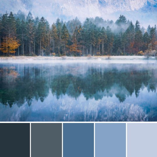
4. November Navy

5. Fall berries
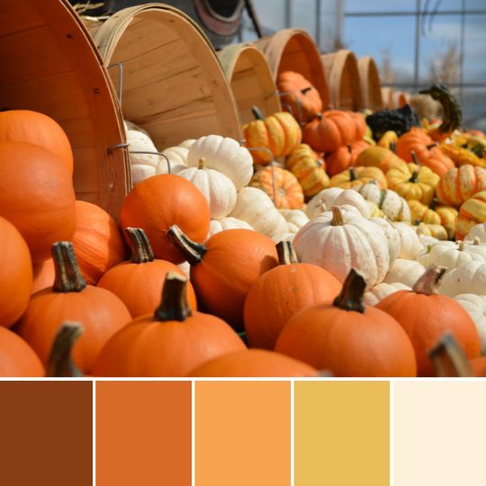
6. Pumpkin spice latte

7. Rich reds

8. Autumnal woodland

9. November neutrals

FAQs
How can I make sure my November wedding is cozy?
First, start with a nice warm color palette, then lots of fairy lights and candles. For later in the evening think about warm drinks and blankets for the guests. Keep the lighting low and warm tones to give a cozy warm glow all evening.
What colors are popular for November weddings?
There are a lot of great fall colors that work well for November weddings. Some of our favorites are burgundy, hunter green, navy, and gray. It is a great time to get bold and think about using darker colors.
- Mastering Your Bridal Shower Budget: A Complete Guide and Budgeting Tips
- I Spy Wedding Game Free Template and tips to creating your own
- Wedding Monogram, Logos for your Wedding Stationery – Free Template
- Emerald Green Bridesmaid Dress Ideas
- Top 2024 wedding styles for an aesthetic vibe and how to create them!
- The Hottest Sage Green Wedding Ideas for Every Season and Style
You’ve set the date, now it’s time to start planning the details! And one of the first decisions you’ll need to make is what colors you want to use for your wedding. If you’re undecided or just looking for some inspiration, take a look at these 11 gorgeous October wedding color combos!
From warm and cozy shades of orange and red to cool and sophisticated hues of blue and purple, there’s something for everyone planning a fall wedding. So whether you’re planning a rustic barn wedding or a glamorous ballroom affair, these combinations are sure to give your big day that perfect autumnal touch.
Choosing your wedding colors
The first step if you already have your venue should be to look at what colors will work with your venue. Then think about the season and theme of your day. If you have a favorite color or one with special meaning this can be a good base color to start with and build a palette with the points mentioned.
Marrying in October
If you’re planning a wedding in October, there are a few things to keep in mind. The weather can be unpredictable, so it’s important to have a backup plan for bad weather. October is also a popular month for weddings, so be sure to book your venue and vendors well in advance.
And since Halloween falls at the end of the month, you may want to incorporate some spooky elements into your decor or menu. With a little planning, you can ensure that your October wedding is both memorable and enjoyable.
2022 must-have October wedding color schemes
1. October Autumn oranges

2. Pumpkin spice latte
3. October rustic color palette

4. Moody October vibes
5. Autumn forest greens

6. Fallen leaves

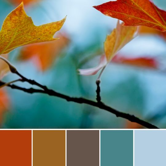
7. October evening sky

8. Natural brown fall color palette

9. Autumn pinks

10. Mustard and blue

11. Fall berries
FAQs
What are the best wedding colors for October?
Some of the best wedding colors for October are warm shades of orange, red, and yellow. These colors can create a cozy and inviting atmosphere, perfect for a fall wedding. You might also consider using cool shades of blue and purple. These colors can give your wedding a sophisticated and elegant feel.
What are the most popular wedding colors for October?
Some of the most popular wedding colors for October are orange, red, and brown. Usually, people chose darker, richer, and warm tones to suit the nature around them.
- Mastering Your Bridal Shower Budget: A Complete Guide and Budgeting Tips
- I Spy Wedding Game Free Template and tips to creating your own
- Wedding Monogram, Logos for your Wedding Stationery – Free Template
- Emerald Green Bridesmaid Dress Ideas
- Top 2024 wedding styles for an aesthetic vibe and how to create them!
- The Hottest Sage Green Wedding Ideas for Every Season and Style
September is the perfect month for a wedding! You still have long days and sunshine. The days and evenings are cooler though and this can make for the perfect wedding day weather.
The season is changing and the begging of September can look so different from the end of the month with nature. You can start to incorporate beautiful rich fall colors into your palette while also keeping some of the lighter summer colors. Making for some stunning September wedding color schemes!
Head to our Autumn color palette guide for more inspo!
Choosing your wedding colors
Marring in September
Having a September wedding means you can probably still marry outside if you wish. Do have a plan B though as you never know how the weather may change. If your reception or evening is outdoors or in a tent think about how you will keep guests warm will the chillier evenings.
Must have September wedding colors
1. Rust and teal
2. Muted rainbow

3. Copper and blush

4. September Sunshine

5. terracotta and white

6. Rustic woodland walk

7. Peach and Purple

8. September skies

9. teal

10. Fallen berries
11. Sage green and

12. Pumpkin Spice

FAQs
What are good September wedding colors?
Some of the best September wedding colors are rust and teal, copper and blush, peach and purple, and sage green. Work with your venue and the natural colors that are around.
What are the colors for September 2022?
The colors for September of 2022 are rust, tan, and brown. These are the perfect colors to use for an autumn-themed wedding.
How do I choose my fall wedding colors?
The best way to choose your fall wedding colors is to look at the natural colors that are around you. Think about the leaves changing color, the pumpkins, and the autumn flowers. You can also use colors that represent the season, like rust, tan, and brown.
- Mastering Your Bridal Shower Budget: A Complete Guide and Budgeting Tips
- I Spy Wedding Game Free Template and tips to creating your own
- Wedding Monogram, Logos for your Wedding Stationery – Free Template
- Emerald Green Bridesmaid Dress Ideas
- Top 2024 wedding styles for an aesthetic vibe and how to create them!
- The Hottest Sage Green Wedding Ideas for Every Season and Style
I love a fall color palette. This season brings rich, deeper warm tones that are a dream to design with! As the leaves start to brown and fall to the ground autumn brings a new feel.
People are ready to start to feel cozier, for a slower pace in life, staying in with the fire roaring. You can create a warm, cozy feeling with the right color scheme and design at your wedding.
How to choose your wedding colors
The first step if you already have your venue should be to look at what colors will work with your venue. Then think about the season and theme of your day.
If you have a favorite color or one with special meaning this can be a good base color to start with and build a palette with. Use your venue and season to add your extra colors to create a complete color scheme.
Having an autumn wedding
If you are planning an autumn wedding then you have picked a great time of year! With fall flowers to work with and the stunning change in nature, I really do believe it is great to plan a wedding.
Go and visit your venue during autumn so you know how it will look on the day. This is hugely important if you are getting married outside or have lots of glass windows. The nature around will change in autumn and this should play a part in the wedding colors you chose.
Also, think about how the change in weather may affect your guests. What items can you include in your day to help your guest feel more comfortable? Offering indoor areas, blankets, and warm drinks. Guest experience should be the front of mind always so make sure you think about having a fall wedding affects them.
Fall and autumn natural colors
Fall brings warm shades and nature gives us the perfect palette to work with.
Reds, oranges, yellows, and greens will all be available from your florist. Picking a mix of these colors for your wedding is a great way to get an earthy feel. Speak to your florist about flowers available, look at their colors, and how you can use that to build your color scheme.
28 Fall wedding colors for the perfect Autumn wedding!
1. Sage green, Brown, and burnt orange
2. Rustic Fall color palette

3. Black and Neutrals
4. bohemian autumn
5. Navy
6. Modern fall
7. Burnt Orange
8. Autumn Rainbow

9. copper and blush
10. Autumn berries
11. Teal
12. Fall Flowers
13. Mustard and blue
14. Moody Reds
15. Autumn Greens
16. Burgundy and Green
17. Neutral fall shades
18. pink
19. autumn grey skies
20. Pumpkin spice
21. Autumn beach
22. Minimal fall color palette
23. Moody blue and oranges
24.
25. October orange sky
26. Autumn browns

27. Autumn Brights

28. Fall leaves
FAQs
There are so many great colors for a fall wedding! I love shades of orange, red, and yellow. You could also go for muted shades like grey or navy.
The best time to have a fall wedding is September or October. This is when the leaves are changing color and the weather is still mild.
October nature will have truly changed and the richer colors will be in full swing. A rich, warm, and moody palette is perfect for October. Head to our October wedding color palette blog for some ideas.
- Mastering Your Bridal Shower Budget: A Complete Guide and Budgeting TipsThe not so fun part of bridal shower planning, the budget! Balancing the dream of hosting a memorable celebration… Read more: Mastering Your Bridal Shower Budget: A Complete Guide and Budgeting Tips
- I Spy Wedding Game Free Template and tips to creating your ownToday, let’s dive into the charming world of the I Spy Wedding Game – a delightful addition to any… Read more: I Spy Wedding Game Free Template and tips to creating your own
- Wedding Monogram, Logos for your Wedding Stationery – Free TemplateI’ve always designed a wedding in a similar way to designing a brand. A wedding monogram is like a… Read more: Wedding Monogram, Logos for your Wedding Stationery – Free Template
Rustic wedding colors
When it comes to weddings, rustic weddings have been on trend for many years and I do not see them going anywhere soon.
If you’re planning a rustic wedding then you need a unique on-trend rustic wedding color scheme.
That’s why I’ve put together this list of 11 must-have modern rustic wedding colors.

Rustic wedding theme
A rustic wedding theme is a popular choice for couples who want to get married in a relaxed and natural setting.
This wedding style often takes place in the countryside or at a barn venue.
The decor for this type of wedding is usually quite simple with lots of natural elements such as wood, greenery, wildflowers, and vintage pieces.
A rustic wedding aesthetic is for couples looking for a relaxed, natural wedding vibe.
How to pick your wedding colors?
The first step if you already have your venue should be to look at what colors will work with your venue. Then think about the season and theme of your day.
If you have a favorite color or one with special meaning this can be a good base color to start with and build a palette with the points mentioned.
What colors are good for a rustic wedding?
There are no set colors that work for every rustic wedding but there are some key colors and color combinations that work well for this style of event.
Some popular rustic wedding colors include Neutrals like cream, ivory, taupe, and gray. Earthy tones like brown, earthy green, and terra cotta.
14 must-have modern rustic wedding color palettes for 2023
1. Rust and greens
Rust tones and greens have to be the perfect rustic wedding color scheme. Earthy, rustic colors that pair together perfectly to give a natural woodland color palette.
Styling Tips
Bring the rust in with the decor pieces, use lots of wood elements. The greens can come from lots of greenery.

2. Green and gray
Green and grey is a soft natural color palette and is perfect for a luxury rustic wedding aesthetic. The beauty of this palette is you can play with the shades and tones to suit any season or style.

3. Best for a spring wedding
Rustic spring greens, a refreshing stylish rustic spring wedding palette. This color scheme is simple but stylish and will create a fresh wedding aesthetic.

4. Best for a winter wedding
Moody rustic vibes all around with this color scheme. I just love this dark neutral color palette for a winter rustic wedding or event!

5. Best for a fall wedding
Green and brown just screams rustic autumn wedding to me! I adore these colors for any season though but they work so well with the natural colors of fall.
6. Woodland romance rustic color palette
Woodland rustic vibes with this color scheme. Greens and greys all mixing together to create a fairytale woodland style.

7. Terracotta and sage green
The color combo of 2022! Terracotta and green is the perfect modern rustic color scheme. A mix of boho and rustic and it is just so naturally beautiful.

8. Celestial rustic greens
Celestial and rustic and are a match made in heaven! They both tie in the natural elements and the need to connect with the natural world. Using greenery blues creates a perfect palette for this mixed wedding aesthetic.

9. rustic orange and peaches
Rust, orange, and peach are a huge 2023 wedding color trend and I see it carrying on into 2024 and beyond! Playing with the tones and shades means you can create the perfect rustic color palette for any season.

10. Minimal rustic color palette
Mixing aesthetics is a great way to make a wedding or event truly unique and personal! Minimal and rustic can in ways seem so far apart but with this neural simple color scheme followed through with the styling it could be a super sleek rustic wedding theme.

11. shades of wood
Is it even a rustic wedding without a wood slice? I must admit I try to push couples away from the typical wood slice centerpiece for a rustic vibe. Wood is a great texture though to use in interesting ways. This color palette pulls all the colors from wood making it the perfect rustic color scheme.

12. Peach, rust, and green
This palette is great for fall/autumn and winter weddings. It is a perfectly balanced palette with sage green and peach lighting the moody tones.

13. Dusty blues
Possibly still my favorite color to use in events, dusty blue. Mixed with soft blues and grays and lots of lush greenery it creates a stylish rustic aesthetic.

14. All the shades of green
I think green has to be ‘THE’ color of rustic weddings. A room filled with greenery of all kinds is definitely what comes to my mind when I think of a rustic wedding or event.

More Wedding design blogs
- Mastering Your Bridal Shower Budget: A Complete Guide and Budgeting Tips
- I Spy Wedding Game Free Template and tips to creating your own
- Wedding Monogram, Logos for your Wedding Stationery – Free Template
- Emerald Green Bridesmaid Dress Ideas
- Top 2024 wedding styles for an aesthetic vibe and how to create them!
- The Hottest Sage Green Wedding Ideas for Every Season and Style
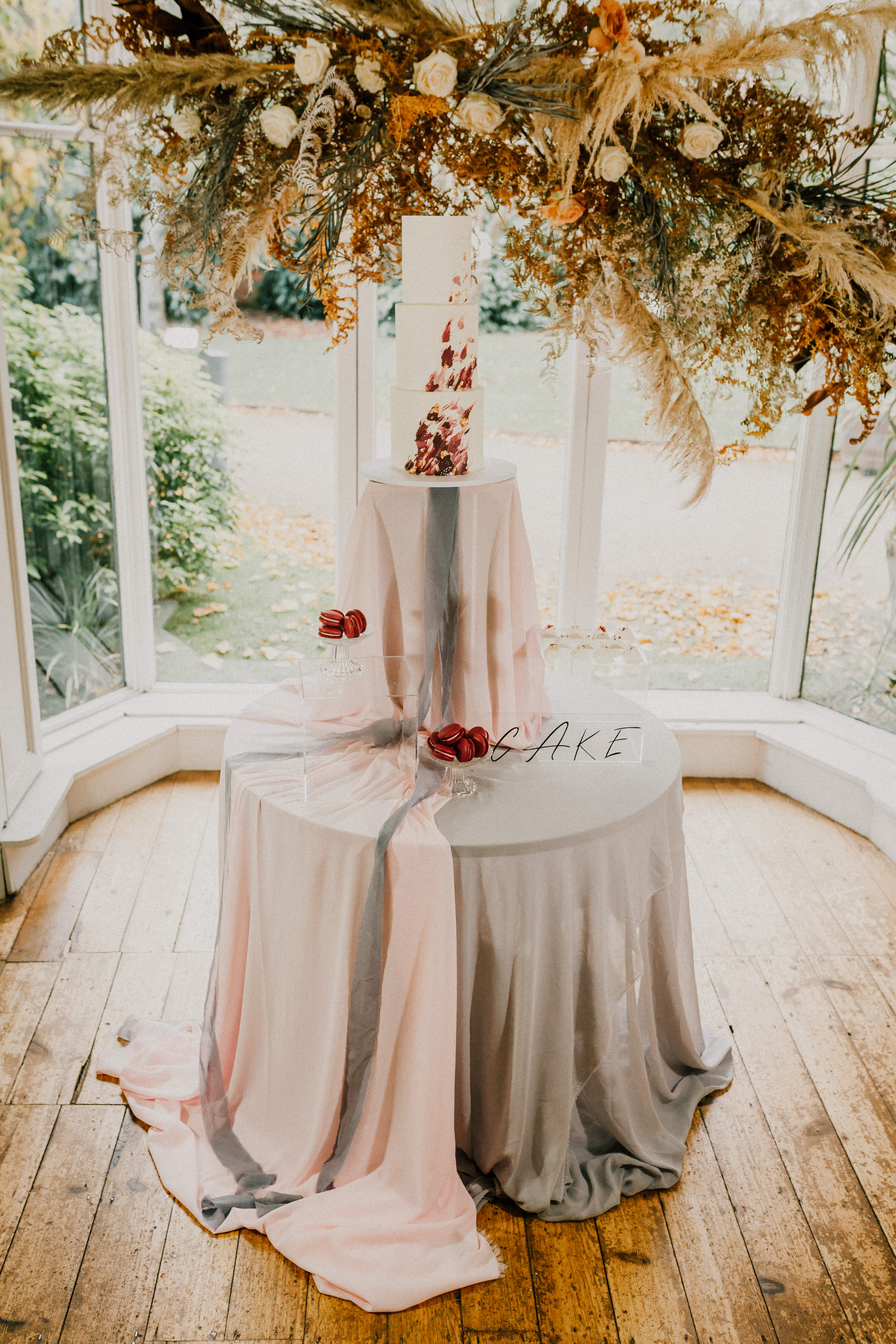
Those of you who follow me on insta will know by now that I am a huge lover of a well-styled cake area. In this blog I am going to share with you some of my favourite cake styling area tips. I am Zoey, a wedding designer & stylist and this is my blog that will hopefully inspire and encourage you along your wedding planning journey.
Why is styling your cake area important?
Why style the cake area? A cake for your wedding or any event can be a big investment. So, why stick it in the corner on a small round table? Well, usually because that was the done thing or because you have way too much to think about planning, and the thought of adding in styling a cake area makes you want to scream! Well don’t worry as just adding a few key elements will make all the difference!
Wedding cakes are pricey! And so they should be they are a work of art some of them. It cost a lot to learn the skills to create a beautiful cake that will still look and taste as good after a long day at your wedding. But not just that your cake maker has worked hard and I feel it deserves the right stage to showcase it.
Grab my free cake area styling guide

Also, the cake is probably the one thing that is guaranteed to be seen by everyone. Every wedding I have been to or designed I always see guests, suppliers and even staff searching out the cake for a look. If all eyes are on the cake you should really make sure it look amazing. It is also a chance to have some fun and add your personality.
If you are a cake maker, stylist or even venue reading this looking for some ideas. I would encourage you to make that extra effort and offer the couple the chance to style heir cake area. Work with local stylist or hire companies to add this an option or buy your own stock. I hire my stock out and most can be posted to other suppliers and it is a great option for cake makers.
My top tips below work for couples, cake makers or anyone looking to up their cake styling game!


Tip 1 – Design
Work with yours or the couples overall wedding design. Make it an extension of the day its self. I think this is important to mention for cake makers. If you are offering the set up and styling ask for a moodboard, speak to the stylist, florist or planner if there is one. Make sure the design works for the wedding as much as it does for your cake.
Add varying heights. Add elements to add interest like candles, vases, signs and florals. Think about textures and using a mix. Chiffon, tulle, linen and cheesecloth fabric all work great. Order an extra runner if doing the styling or if a cake maker think have a go to stock of these. The cake area is a great place to splash out and get a hand dyed silk runner.
Think about the colours and textures in the cake and how you can work with and enhance them with the styling.
Tip 2 – Think Big!
This is the space to go all out! As mentioned it is the area most guests will see. You will have photos taken here to remember for the rest of your lives together. So have fun, think big and see what you can come up with!
Try to think past the standard table. Look at plinths, swings or whatever you can imagine up. If using a table use a mixture of stands, or unique backdrops. I love Bramble sky’s collection, below are a few of my favourites. This goes for both couples and suppliers. Look at what you have and then imagine how you can take it that one step further.
Sometimes a great backdrop is enough, using plinths instead of a table. Getting a wow factor cake stand. It doesn’t take much to so even if you pick one thing and think as big as you can with that it will make all the difference.


Tip 3 – Reuse
This one I always advocate with my couple and fellow suppliers. It is harder as a DIY couple as you really won’t have the time. If you have a stylist or planner or great hands on venue then ask them about moving items for you. This goes for all of your items and spaces not just styling the cake area.
Take what you can from the ceremony to use at your cake area. Whether that be florals, candles or fabrics. The main one though I think is he best to reuse is a backdrop. I actually have most of my backdrops in two sizes, one for the ceremony and then the cake area. As it saves the time moving and frees it up for adding to another space if and when required. I suggest moving the ceremony back drop behind the cake. Then after the cake is cut, move the tables or plinths and you have a photo backdrop for your reception guests.
As I keep mentioning whether a couple, cake maker or stylist. You need to work with the other suppliers, find out what they have that can be moved and reused. Let them know, especially the florist as they can make them easily movable. Or give you instructions if needed. Have a plan of what will be reused and make sure everyone who needs to be is aware as the time frame is usually tight so planning ahead is a must!
Tip 4 – Personality
The cake area is a great place to share more of your personality or love story. This can be in little ways, like a topper or signs. You may add decorations, pictures that tells a story of the two of you. For me creating emotion is the great event design and using personal items that the guests can connect with does this. It can be so simple as grandmas cake stand! Most guests know what it is and has their own story and emotions attached to it. A small little detail that will have a huge impact.


Tip 5 – Placement
Placement! Tradition is on the dance floor or next to the top table! Who cares about tradition though! These can work well and mean the guest can see the cake easily throughout the day. But sometimes I feel not always practical.
If you are going all out and making a big feature of the cake area then a little out the way is a better choice. Make sure it is not a high traffic area. This could effect guest flow when moving throughout the day. Also, not out the way too much no one knows where it is!
lastly, look around and see what you are placing it near or in front off. Sometimes you have no choice but fire extinguishers, window with a terrible view or worse curtains! These things can have a huge impact on the final overall look. This is when you have to consider a backdrop to cover certain feature of the venue.
Styling a wedding cake area
I hope you found this useful. I am working hard on my blog to overall aspects of wedding design and styling. To help not only couples but other wedding suppliers to understand and use design. If you are looking for a designer for any type of event get in contact I would love to chat! Or if haven’t already grabbed my wedding cake styling guide free now.
Don’t forget to pin it to save for later!

More wedding design & styling help blogs
- Mastering Your Bridal Shower Budget: A Complete Guide and Budgeting Tips
- I Spy Wedding Game Free Template and tips to creating your own
- Wedding Monogram, Logos for your Wedding Stationery – Free Template
- Emerald Green Bridesmaid Dress Ideas
- Top 2024 wedding styles for an aesthetic vibe and how to create them!
- The Hottest Sage Green Wedding Ideas for Every Season and Style
Colourful styling at the new Giraffe Shed wedding venue. I am Zoey, a wedding designer and stylist and this is my blog that will hopefully inspire and encourage you along your wedding planning journey. Today I am sharing with you an oldie but a goodie! I don’t get to do colourful too often and I must admit I am a neutral and moody lover myself. But a bright colourful wedding really does cheer me up!
The shoot was set in this gorgeous new wedding venue in South Wales, The Giraffe Shed. I headed up there in the summer with a brief of colourful, festival style, I had to add a little edge though! Which, I hope always add!
This venue was the making of Hannah and her husband, Hannah is a photographer and you can certainly tell, not just for the amazing lighting throughout the venue there are some pretty amazing photo backdrops too. I certainly fell in love with this venue, a modern blank canvas with some industrial elements, that pretty much ticks all my boxes.


Styling the Giraffe Shed
I decided to add some industrial elements to the styling to work with the venue. Then the rest was all about the colour! I used all jewel tones. It is really important when working with a colourful palette to keep to the same shade, tones or tints. It gives a well-designed feel and adds luxury.
My favourite part was the chair ribbons. I spent longer than I care to admit messing with the ribbon and deciding a way to thread them. Just tied on looks nice but I feel the weaved look just lifts the design and looks super stylish! We kept the table minimal as there was so much going on with the chairs and colours. Just some key elements to add the industrial modern feel.
If you are looking for a wedding stylist for a colourful or any wedding, then get in touch!
There were some amazing suppliers involved, go check them out!
Photographer: Jade Maguire Photography Venue: The Giraffe Shed Dress: Shikoba Bride Models: CJ Carpenter / The Unidentified RockerLeather Jacket: Ophelia Rose Cake: Cow and Cake Glitter: Luna Glitter Bar Flowers: Bizzi Lizzi Flowers Styling: Zoey Louise Design Newspaper: Photo Press Stationery: Knock Knock Penny Studio Lighting: Peter Lockwood Hair: Ypdws Elinwyn Bridal Hair Make Up: Toni Searle MUA
What is a wedding designer? So I get lots of questions about what I do, how I compare to others and my packages. I call myself a wedding designer and stylist! I do still resonate with this title and will carry on offering styling services but as my skills and passion have developed I am pulled more towards the design aspects of events. You may have noticed my all-new website and branding. So my focus is moving towards designing over styling, I will still style wedding but slowly my assistants will take over this part more and more,
For most planning their wedding, everything is all new to them. They come across all these terms they just have no ideas what they mean, wedding planner, stylist, designer and venue decorator. I find a lot of couples see me as a venue dresser so get caught up on the items I am providing. Couples get to use of all my items they need though. As they are booking me to design their day and not just turn up with hired items and go before anyone arrives. My focus is not the items it is the overall style and design. My items are there to help bring the vision together but my main focus is designing a day that is perfectly you.

Why event design?
This is part of my reasoning to shift toward event design, I feel it is clearer for couples and is a truer reflection of what I do. So why event design and what does it really mean?
“Event Design is the creation, conceptual development and staging of an event using event design principles and techniques to capture and engage the audience with a positive and meaningful experience. ”
S. Brown 2013
For me, any event but especially weddings is about creating an experience. A carefully planned, well thought out wedding allows you to control the feelings and experience of your guest. Yes a focus is on the look of the day but that is to set the scene, it is then important to tie in all other elements creating a unique experience the guests will remember forever. I think of it as telling a story and walking your guest through each chapter or playing out the stage version right before their eyes.
Guest experience
One thing I hear a lot, I mean a lot! ….. is, but will the guest really remember what colour the napkin (or insert any small item) is? No, I hope not! That is not what it is about, picking all these key elements so they effortlessly marry together and not stand out is the aim. They may not notice the matching grey linen napkins and tablecloth but am sure they would notice the harsh bright white nylon ones you may pick because well, no one really notices the napkins anyway do they!
The design process starts at the beginning, from your first choice which is usually venue and photographer. Picking the right style venue that is practical but also you love is key to the whole design process. Then, making sure you choose the right photographer to capture every moment just how you envisioned it. Every choice you make big or small plays a part in the overall experience of your guests and the memories you and they will have forever. You only do this once right? Let’s make sure you look back on it in 10 years time with the same love and devotion you will feel for your other half on the day!

Planner, designer, stylist and venue dresser differences
Wedding Planner
A planner focuses on logistics. Coordinates the whole day and all suppliers. They are super organised, checklist in hand. They make sure the day and the run-up goes with our a hitch. Or if it does you would never know about it. Planners are great for the design couples who need some help bringing it all together and keeping everyone organised.
Wedding Designer
They are in ways a design-led planner. It is not just about the pretty. They work with you to design an authentic day that is both beautiful and practical. It is about the guest experience and creating moments with a well-curated design. They work with a source all visual and create suppliers that enhance the design of the day. This is for the couples that want an experience over a wedding, their guests to not just be wowed but remember for a lifetime.
Venue Stylist
An on the day designer in ways! They are all about the pretty. Curating pieces and styling them to perfection on the day. Working with other visual suppliers on the day for a cohesive look. This is a great option if you want to handle the design yourself but need an expert eye on the day and before to make sure it all fits perfectly. Head to my what is a wedding stylist blog for a more in-depth definition.
Venue dresser
They are more a hire company. They have their stock you hire, usually includes set up also. You choose your items from their stock and they set it up or you collect. Very cookie cutter, one size fits all. Great choice if the design is not a big focus for you or you are a DIY couple.
Hiring a wedding designer
I say this a lot as I truly believe it. Yu should do you research, meet with them and make sure you really are the right fit. Okay, everyone has a budget. You need to look past this though and make sure you trust and connect with them, as they will be a big part of your day. I always do my best work when i have the freedom to get imaginative and I have trust from my clients.
If you are interested in my services or would like to chat to see how we connect, then get in touch I would love to.
