Colour palette for a wedding or event
This one is a biggy! I am bringing you the ultimate guide to creating a color palette for a wedding or event.
Now, this is aimed at those wanting to really dig deep into colors. It goes in-depth, we chat about color theory and phycology and working with colors from a design perspective. Head to my quick 5 step process if you just don’t have time for all the faff! If you are a geek like me then carry on reading for the deep dive!
I also share different palette options and how to use them for events. If you are a bride or groom looking for advice on color palettes or a wedding supplier, or a creative business looking to learn more this is the blog for you!
If you prefer to print/download and read later grab the printable version. Full of extra information and some templates.
I believe having an understanding of color, how they work together and the feeling they can create is a must for any designer. Most creatives in the wedding industry will have elements of design in their work. Cake makers, florists, planners, and of course stylists and designers. This guide will help those wanting to get into event design but also any creative wanting to understand color palettes and how to work with colors.
Colour terminology
So I throw some words around in this blog and it is not imperative you learn them but having an understanding will help you with your color knowledge. Like most, I am still guilty of saying what a lovely shade of blue!
Really shade? That is a tint actually!
This is not something we hear often, never in my case, so don’t get caught up with the terminology but they are useful.
Also, when working with other designers, especially stationers it is good to be able to communicate clearly. Knowing the right terms will help.
- Hue: Pure color, primary colors, or a non-mixed color. Not black, grey, or white.
- Tint: Adding white to the hue. Lightening the color, not brightening even though it may appear so, it is a paler version of the color.
- Tone: Adding grey to the hue. Truetone is only adding grey, no other pigments. A pure mix of white and black. Think muted, moody colors in the wedding world!
- Shade: Adding black to the hue.
- Neutral: Hues that appear to be without color. The main neutrals are black, white, brown, and grey. All other neutrals have a hue undertone but are called neutrals by most.
- Analogous: Sit next to each other on the color wheel.
- Complimentary: opposite colors on the color wheel.
- Split-complimentary: The two colors on either side of the opposite
What is color?
Colour is the term we use to describe every hue, tint, tone, and shade we see.
Colour is relative! An object appears colored because of the way it interacts with light. We perceive color through vision, light, and individual interpretation and understanding.
This is important to remember when working with clients or others in general. If I say to you the color blue, each one of you will picture a different color in your head, a slightly different shade or tint of what we would consider true blue. Even with added description. dusty, pale, dark blue we will all picture a different color.
With the digital world, we can create unimaginable amounts of colors. A lot can’t be recreated in the natural world so easily. That is why it is important to work with a mix of shades, tints, and tones when creating an event color palette.
Ask for pictures, and swatches, and share the colors in different formats for clients so they understand a true reflection of the color palette.
Even in digital form, a color may look different not just to someone else because of perception. Screen lighting and setting will affect the look.
A good example is that dress that went around and how people saw two different color sets! Crazy that we can look at the same colors at the same time but see them differently.
We also feel different when looking at colors, which we will discuss next in color phycology.
Color phycology
Color psychology is the study of how colors affect human emotions and behaviors. Each color has a different meaning and feeling that it is associated with.
Some examples of colors and their meanings are listed below:
• Blue is often thought to be calming and soothing. It can be used to create a sense of trust and security.
• Green is associated with health and nature. It can be used to create a sense of balance and harmony.
• Orange is associated with happiness and vibrancy. It can be used to create a fun and festive atmosphere.
• Red is associated with passion and excitement. It can be used to create a sense of energy and urgency.
Colour Theory
Primary colors & secondary colors. In the traditional sense, Red, blue and yellow are our primary colors and we use these mixed with each other to make our secondary colors and tertiary colors, and all the rest.
Tertiary colors are double colors if you like, blue-green, red-purple, etc.
In the digital world, things get more complicated. We work within RGB and CMYK and the primary colors are cyan, magenta, and yellow. This is because we are working with light and inks for printing.
Without going into too much depth here I just wanted to mention this. It is something to be aware of especially when working with different suppliers. A graphic designer over hand-painted stationer. Also, cake makers will mix their fondant colors in a traditional sense of colors.
It also affects the color wheel and how we see compliment and analogous colors. We discuss more by looking at the traditional and modern color wheels.
Colour Wheel
Traditional and modern color wheels. Digital primary colors are different from traditional colors. Because the colors are used by light rather than mixing of colors like traditionally. It is all beautiful maths but I won’t go into all that here!
I just wanted to explain as the wheel and its contrast and compliments are slightly different.
Traditional color wheel
Red, blue and yellow are the primary colors. Orange, green, and purple are the secondary colors.
The tertiary colors are double colors: red-orange, yellow-orange, yellow-green, blue-green, blue-purple, and red-purple.
The color wheel can be split into warm colors (reds, oranges, and yellows) and cool colors (greens, blues, and purples). Warm colors are associated with fire and energy. Cool colors are often thought of as calming and soothing.
Colors that are opposite each other on the color wheel are called complementary colors. For example, blue and orange are complementary colors. When used together, they can create a striking contrast.
Analogous colors are colors that are next to each other on the color wheel. For example, blue, blue-green, and green are analogous colors.
When used together, they can create a harmonious and soothing effect.
The color wheel can also be divided into four quadrants: primary colors (red, yellow, and blue), secondary colors (orange, green, and purple), tertiary colors (red-orange, yellow-orange, yellow-green, blue-green, blue-purple, and red-purple), and neutrals (black, white, and gray).
Primary colors are the most important colors because they cannot be created by mixing other colors together. They are the building blocks of all other colors in the traditional color wheel.
Modern color wheel
The modern color wheel is slightly different from the traditional color wheel. The primary colors are cyan, magenta, and yellow. These are the colors used by light rather than pigment.
The secondary colors are red, green, and blue. The tertiary colors are double colors: cyan-blue, magenta-red, yellow-green, etc.
As with the traditional color wheel, the modern color wheel can be divided into warm and cool colors. However, because of the difference in primary colors, the division between warm and cool is not as clear-cut as it is in the traditional color wheel.
Colors that are opposite each other on the color wheel are still called complementary colors. However, because the primary colors are different, the complementary colors are also different. For example, cyan and red are complementary colors.
Analogous colors are still colors that are next to each other on the color wheel. However, because the primary colors are different, the analogous colors are also different. For example, blue, blue-green, and green are still analogous colors.
The color wheel can still be divided into four quadrants: primary colors (cyan, magenta, and yellow), secondary colors (red, green, and blue), and tertiary colors (cyan-blue, magenta-red, yellow-green), and neutrals (black, white, and gray).
The main difference between the two wheels is that with the modern color wheel the color combinations increase and with this there is an audience of colors that can be created.
Hues, Tints, shades, and tones
Hue is the name of a color on the color wheel. For example, blue is a hue. The tint is a hue to which white has been added. For example, light blue is a tint of blue. Shade is a hue to which black has been added. For example, navy blue is a shade of blue. The tone is a hue to which both black and white have been added. This makes the color less intense and more muted. For example, pale blue is a tone of blue.
Value is the measure of how light or dark a color is. A color can be made lighter by adding white (this is called a tint) or darker by adding black (this is called a shade).
The value of a color can also be changed by making it more or less intense. This is done by adding a color that is opposite it on the color wheel (this is called a tone). For example, orange can be made more intense by adding red or less intense by adding yellow.
The value of a color is important because it affects how easy it is to see. For example, light colors are easier to see than dark colors.
Saturation is the measure of how pure a color is. A color can be made more saturated by adding another hue that is similar to it on the color wheel or less saturated by adding a neutral (black
Choosing your color palette or color scheme
So I have given so much theory and rules around color! I have done this as I do believe knowledge is power! Having a good understanding of colors and how they work together means you can experiment and be adventurous!
I also believe in throwing out the rule book and being a rebel! As mentioned before color is relative! If you love a palette, or your couple loves it and it works for the space then go for it!
I think having the underlining knowledge though can help give you the confidence to do this and also the skill to make it work and look amazing.
Here I will share popular color schemes and ways of mixing colors together. Again to give ideas and inspiration.
Contrast with colors
Again this is a big subject and we will briefly touch on it here as it is an important factor when creating a color palette. Contrast is how the color stands apart from another color or colors.
High contrast, easily stands out. Low contrast, neither stands out over the other. A too low contract can lead to a flat dull palette, while too high can lead to a harsh overwhelming color scheme.
It is not all about the color choice. You need to consider the tone of the colors, and how much grey is added. If very similar in all colors you will have no contrast. I usually always have at least one contrasting color in my wedding palettes. This may be the accent or maybe be a tint, shade, or tone within the main color scheme.
It is all about balance and depending on the overall feel on how much or little contrast you add. Playing with a mix of analogous and complementary colors and adapting and using a mix of tones, shades, and tints of the colors.
Using a complementary color scheme
This color scheme uses colors that are the opposite of each other on the color wheel. This can create a very bold and striking look for your wedding.
I would recommend using one or two complimentary colors with a base of more neutral tones. To break up the harshness you can use tints, shades, or tones of the complementary or main colors.
Head to my best complimentary color palettes blog for lots of ideas like this one!
Split complementary colour palette
If you want to use a complementary color scheme but feel it may be too harsh then this is a great alternative. You take one main color and then the two colors on either side of its complement. This gives you a softer palette while still having that wow factor.
Head over to my best split complementary color palettes blog for some inspo!
Creating an analogous color palette
Analogous colors are colors that sit next to each other on the color wheel. This can create a very harmonious and calming feel for your wedding.
You can use a mix of all colors within this scheme or pick one or two as your main colors and base the palette around these. Again using tints, shades, or tones of these colors helps break up the colors and stops them from being too ‘matchy matchy’
Using a monochromatic color scheme
All the tones, tints, and shades are within one hue color. This is usually how I work with my wedding palettes for the base and main color. You can add so much depth, interest, and even contrast using just the shades, tints, and tones of one color.
If you are new to working with colors monochromatic is the best place to start. You can then start to add contrasting tints or play with an accent color to see how it affects the overall feel and look.
Then take two colors or a tertiary color and get creative building color schemes with different shades, tints, and tones that fall within the two of them. I like to think of it as both colors merging together slowly and all the mix of tones, shades, and tints that make it up.
A good way to start is to have a play on Canva or if you have an Adobe program. Pick your main color and select the color picker box and move the picker around. Every single color in that box is a shade, tint, or tone of your color. You can see how much variety there is and how you can make a color palette full of depth, interest, and contrast just using a monochromatic color palette.
Neutral colors
For event design palettes neutrals are used slightly differently. The main reason is we are usually working with flowers and nature.
Also, certain colors can work as a neutral for the palette but may not be neutral in the true sense. i.e. certain greens. They are used in a similar way in interior design. It is neutral with a hue undertone.
I like to think of them as having no impact.
They compliment all the other colors so well and in equal measure, that it has no effect. There is no contrast provided. It works as a great base to build on. I usually pick neutral colors based on the venue or area we are setting up. As it not only needs to be neutral to your colors it also needs to work with its surrounding. Done well it can be the perfect merge of the surroundings and the chosen color palette.
My wedding and event color palette process
I follow a similar process for most weddings and events. I break my color palette up into 3 parts. I have my base-neutral color, my main color(s), and the accent color.
Even if working with a mixture of colors I will break my palettes up this way. Remember what we spoke about before, if you have the same tone in all your colors they mold well together and no contrast is created.
So in a way you can still bunch as one color when working with this method. Of course, they are not but they have no real effect on each other and any added colors neutral or accent will have the same effect on them equally.
Base color –
The base color is your neutral color. It will take up 70% to 80% of your design.
It doesn’t have to be white, black, brown, or grey. I do use grey a lot as a base though. There tends to be an overuse of bright white as a base color in weddings, it is usually in its purest form. This creates contrast from the start, which is not wanted for most designs.
Softening the hue slightly or adding a slight undertone can make all the difference to the overall feel. Think taupe, grey-white, and stone colors.
As previously mentioned neutrals don’t need to be pure neutral colors. It is about finding a color that works well with your main colors and accent to achieve the desired feel. You can take a Palette from light and airy to moody and dark with a swap of a base color. You can play with tones, shades, and tints of your chosen palette to manipulate the outcome.
Playing with your neutral against your main color can make the color pop or calm it down and neutralize.
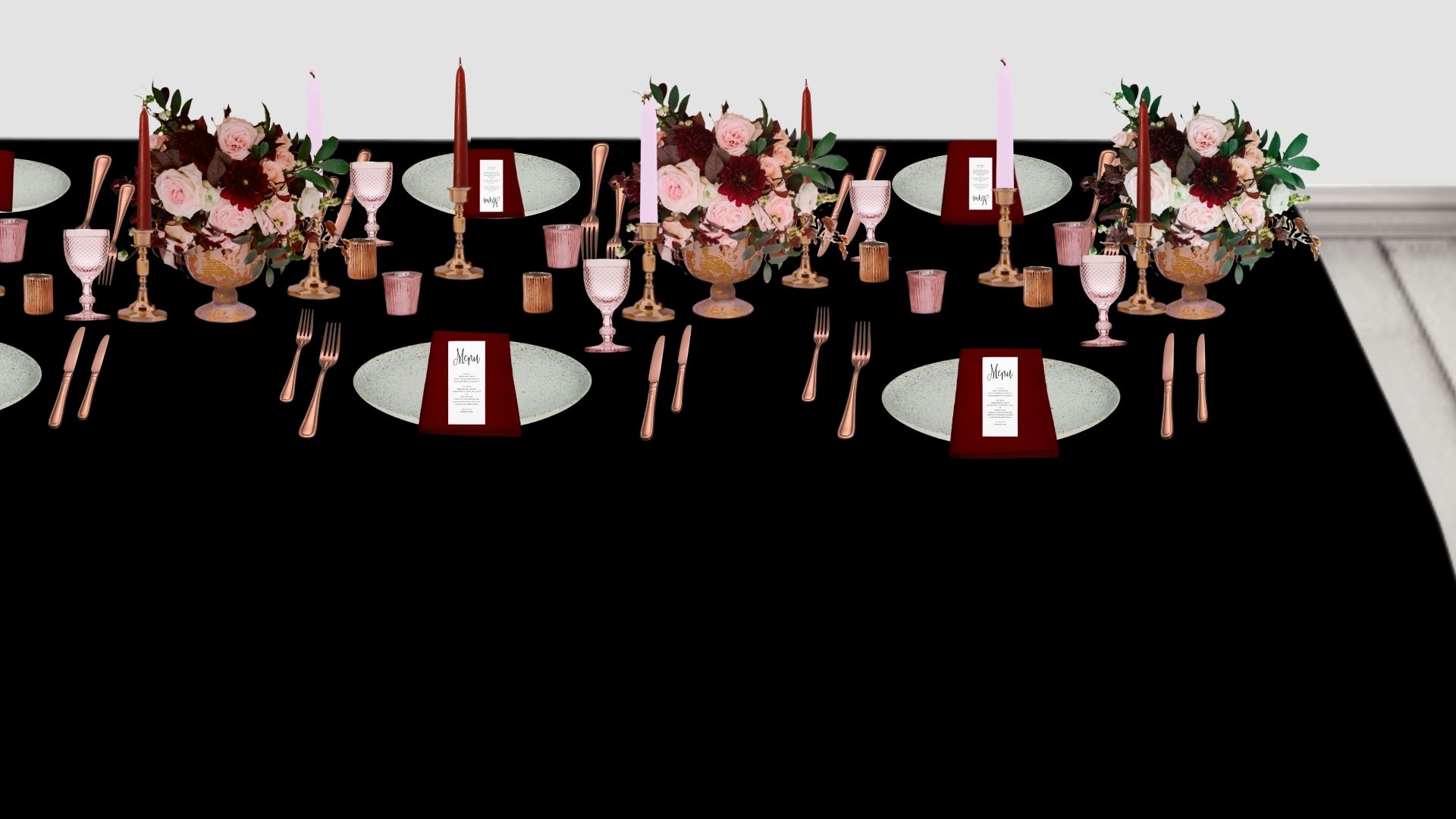
Below are some renders. I have changed only the tablecloth color. This is in the simplest sense to show you the effect of changing or choosing your base neutral. Of course, other elements would change in the design with a real wedding.
With the white and black the colors still pop. They are the colors in their purest form. I personally would use a softer black or white and the white is toned down slightly.
With the grey, you see how the darker red pops while the toned-down reds, the pinks, are more subtle. The copper also has some contrast, more than the lighter red.
With the pink undertone neutral, ideally, I wanted less pink, this is white with a really light red undertone. Hard to achieve with this render. Again, the darker reds pop, and the toned-down lighter reds are softer on the eye.
Also, look at each picture and think about the feeling you have. The black adds a moody modern vides and with the copper contrast high adds a warm feel. The grey for me really neutralizes the whole feel and makes it feel romantic and soft. The white adds freshness and vibrancy to me. The pink I feel works similar to the grey, with a soft relaxed feel and more understated look.
These are of course digital mock-ups but I hope they help you understand the effect of your base on your main colors and the role it plays to create the overall feel for the day.


Main color
This is where monochromatic comes in. Sometimes I do this with the base also or instead but for the majority of palettes and for simplicity I will talk about it as the main colors only.
As mentioned monochromatic is all the shades, tints, and tones within a hue/color. You can really play with this depending on the color you choose, you can have a vast range. Take Burgundy, which is a mix of red, brown, and a tint of purple. If you work with burgundy as the main color and look at all the shades, tints, and tones then you will see you can range all the way from red to purple.
I also sometimes use a set of 3 analogous colors mixing their shades, tones, and tints so they melt beautifully together. I love to use just the right amount so it is as if you can’t fully tell where one color ends and another begins.
The best way to learn is to set up the picker and have a play. Here I have 4 monochromatic color palettes. No base or accent. I have done pink, blue, red, and purple. I have shown my chosen color and its code and then picked a palette using the color picker on Canva.
Have a look yourself and have a play and see what palettes you can create. Playing with colors is the best way to learn and grow your understanding.
Accent color
This is usually a metal; gold, copper, brass, or silver. It doesn’t have to be though, it can be a color also. I often use black as an accent color and it is a great modern accent that adds some wow while keeping it elegant.
Look at your colors, venue, and style, and think about what will work best. If you have a period venue and going for a timeless design then brass would work perfectly, think vintage brass candle sticks running down the tables. If you wanted it to look a little more modern then swapping to gold and simpler candlestick it would change the feel while still suiting the venue.
Wedding color palette and color schemes
Even though there is a lot of information in this blog it really does only touch the surface of colors and learning how to use them. I have repeated this but the best way is to practice, and try out color palettes. Have fun, experiment, and enjoy the learning. If you have any questions reach out to me.
The ultimate guide to creating a color palette for a wedding or event.
About
Services
Portfolio
Blog
Contact
Luxury Design and Styling for Weddings, events and brands
Download my free cake area styling guide.
Download now
GRAB YOUR CHECKLIST


