Spring wedding color palettes. Spring, the season of new life! The world starts brightening up, lighter days and everyone has a spring in their step! Okay, a little corny! But for me also true, I start to feel better, and healthier and my mood lightens with spring.
So of course for me, a spring palette needs to be fun, playful, and colorful. But also light and refreshing. For this, we have to choose our colors, shades, and tones carefully to create the perfect spring color palette. Toning down colors works very well and is usually associated with pastel colors. You can have a bright colorful palette that still feels fresh as the colors are toned down.
Colour palette basics
So I like to break my palettes into 3 colors for most events. I have my base color which is the one used in 80/90% of the design. Then the main color is the color of the event or wedding. The color everyone remembers. You want to use this in pops though, not all over the space so it becomes overpowering. Remember with both of these colors you want to mix in different shades and tones. Don’t stick to the same exact color for every little item.
Then you have your accent color, usually a metal like gold, copper, or brass. This can definitely be a color also though. This I use to either tie the colors together or add contrast if needed. You will be surprised how much effect an accent color can have on the overall design.
You can of course add in a contrasting color or do a mix of colors. It really does depend on the overall design of the day. But for the majority of my weddings, we work with this style of the palette. If you are new to event design or designing your own then this is the easiest way to build a great palette. I think spring is a good time to mix it up though and really play with your color scheme and mix up the way you use your colors.
Top 5 spring color palettes

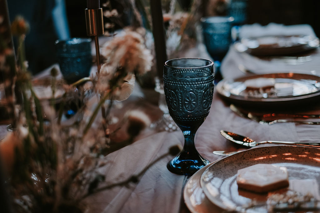
Colour Palette 1
Pantone color of the year 2021, yellow and grey! Yellow is the perfect spring colour. In this palette, we included the light grey to work with Pantone colors, adding tints to draw it into white. Then the same with the yellow but deepening the shade of yellow heading into the mustard color you see above. The accent is gold, again to playing on using a mix of yellow shades and tones, you can think of gold and a metallic yellow in a way as it is so similar.
This is a perfect fresh yellow colour scheme. It works for spring and summer weddings. You can mix it up and change the base or accents or even the yellow shades to get it to work well in Autumn or winter.


Colour Palette 2
I love that this palette is modern, simple but packs the wow factor. Here you can swap the main colour to any colour and it will still give a cool modern feel. Yellow works well, it is a great way to do pink also but still have a modern feel.


Colour Palette 3
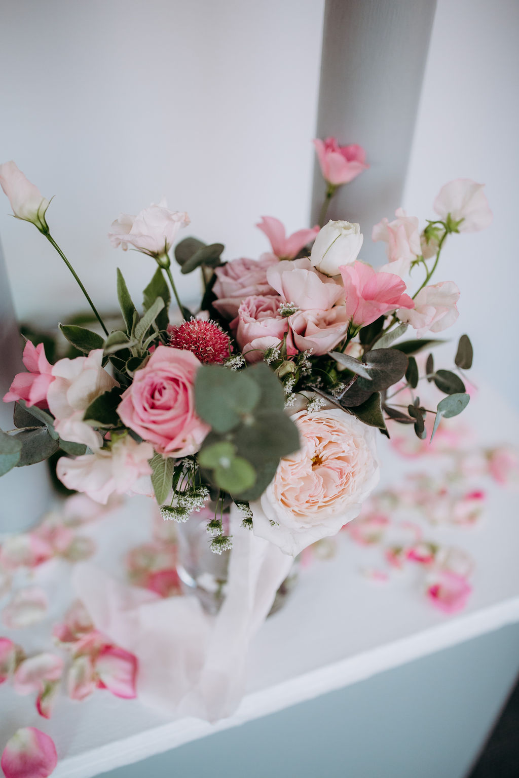
I love this one for a spring palette. I think it is also a great example of how much changing the shade or tone of colour really affects its overall feel. Using lighter shades of purples and pinks gives a soft beautiful palette. Using the lighter grey as a base softens the feel even more and adds a little freshness, perfect for spring.

Colour Palette 4
This palette is the perfect spring or summer red palette. The greens in the accent come from the greenery in the flowers. Crisps whites help the reds really pop. Giving a bright colourful and fresh palette. It is the perfect spring garden color palette.
Adding lighter reds will give a brighter, softer feel. Going with darker reds adds drama, and created a bold palette. It is definitely the palette for rose-loving couples! All you need is lots of greenery and all the shades of red roses and you have the perfect garden wedding style, any guest would be honoured to attend!
This is perfect for an outdoors wedding. Or if you want to create that garden feel indoors. Using pink and red roses as if natural growing around the venue gives a beautiful secret garden vibe. Here we have taken the red and adding more and more amounts of white lightens it to create our pinker shades.

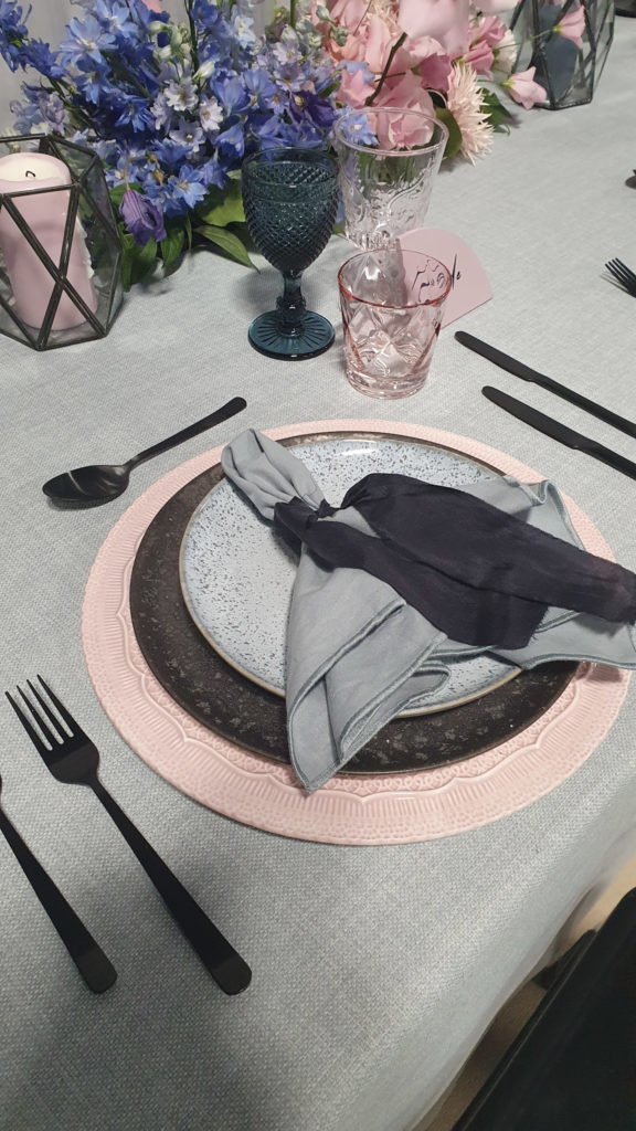
Colour Palette 5
The perfect way to do a multicolour scheme in springtime! I love a modern pastel palette! It is a huge spring trend and I have seen some amazing shoots using this palette! Fun, bright and bold! You can really get creative, with modern floral designs it add a artistic modern playful feel to the day.
It is the perfect choice to use with another huge trend, curved shapes galore! I am loving the backdrops, stationery and everything curved! It add such a modern feel, gives the design a some fun but stylish elements. So I decided that this one will be the one I do some digital designs for.
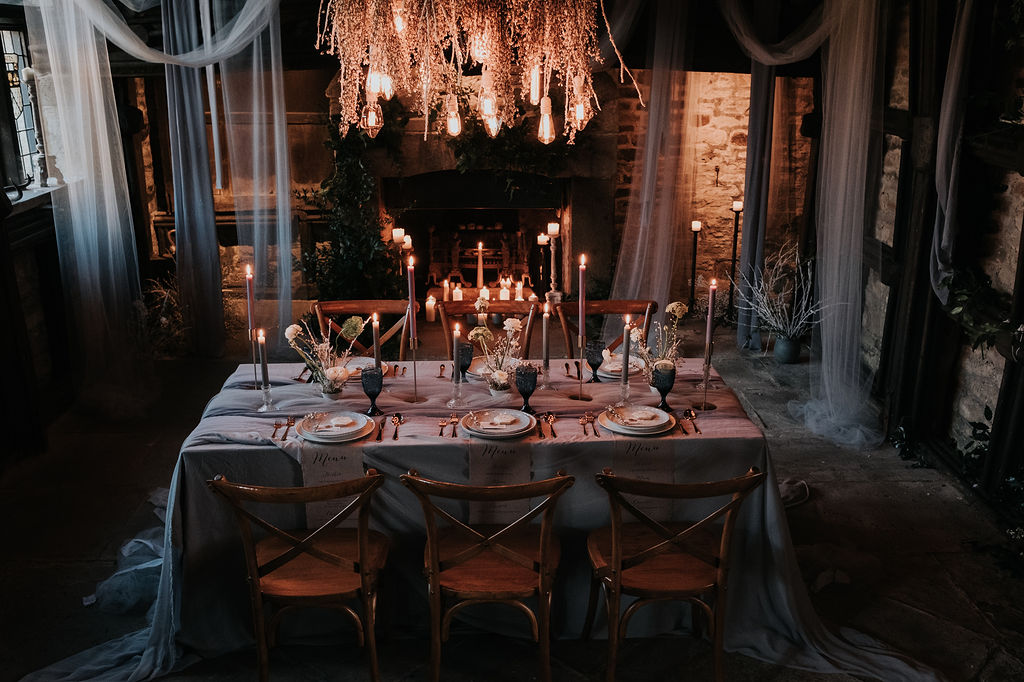
Backdrop mock ups
With my full design clients, I love to focus on the detail of the design. I always do these mockups. Usually the table setting and any feature areas or focal points of the day. If I or my couples can’t envision a certain design these are how I show them and fine-tune the tiny details myself. Now, if I could draw I would but my creative skills never spilt into drawing skills!
So we are working with Palette 5. We have the overall moodboard, this is a quick design moodboard. My couples get one for each area plus a brief in their design plan.

A normal wedding mood board would be more in-depth than this. I still try not to include to many wedding shots. Flowers are okay but not completely styled looks. We want to be creating something unique not copying.


Spring wedding color palettes
I hope you found this blog useful and you are now full of spring wedding ideas. Remember to keep it simple with your base, main and accents. Use slightly different colors or shades to add depth and interest to your design.
Check out some more wedding design blogs.
- Emerald Green wedding color ideas for a stylish wedding

- Bridal Shower Schedule – Order of Events and Free Itinerary Template

- Mastering Your Bridal Shower Budget: A Complete Guide and Budgeting Tips

- I Spy Wedding Game Free Template and tips to creating your own

- Wedding Monogram, Logos for your Wedding Stationery – Free Template

- Emerald Green Bridesmaid Dress Ideas

- Top 2024 wedding styles for an aesthetic vibe and how to create them!

- The Hottest Sage Green Wedding Ideas for Every Season and Style

- Creating a Wedding Seating Chart, Minus the Stress with My Template!

