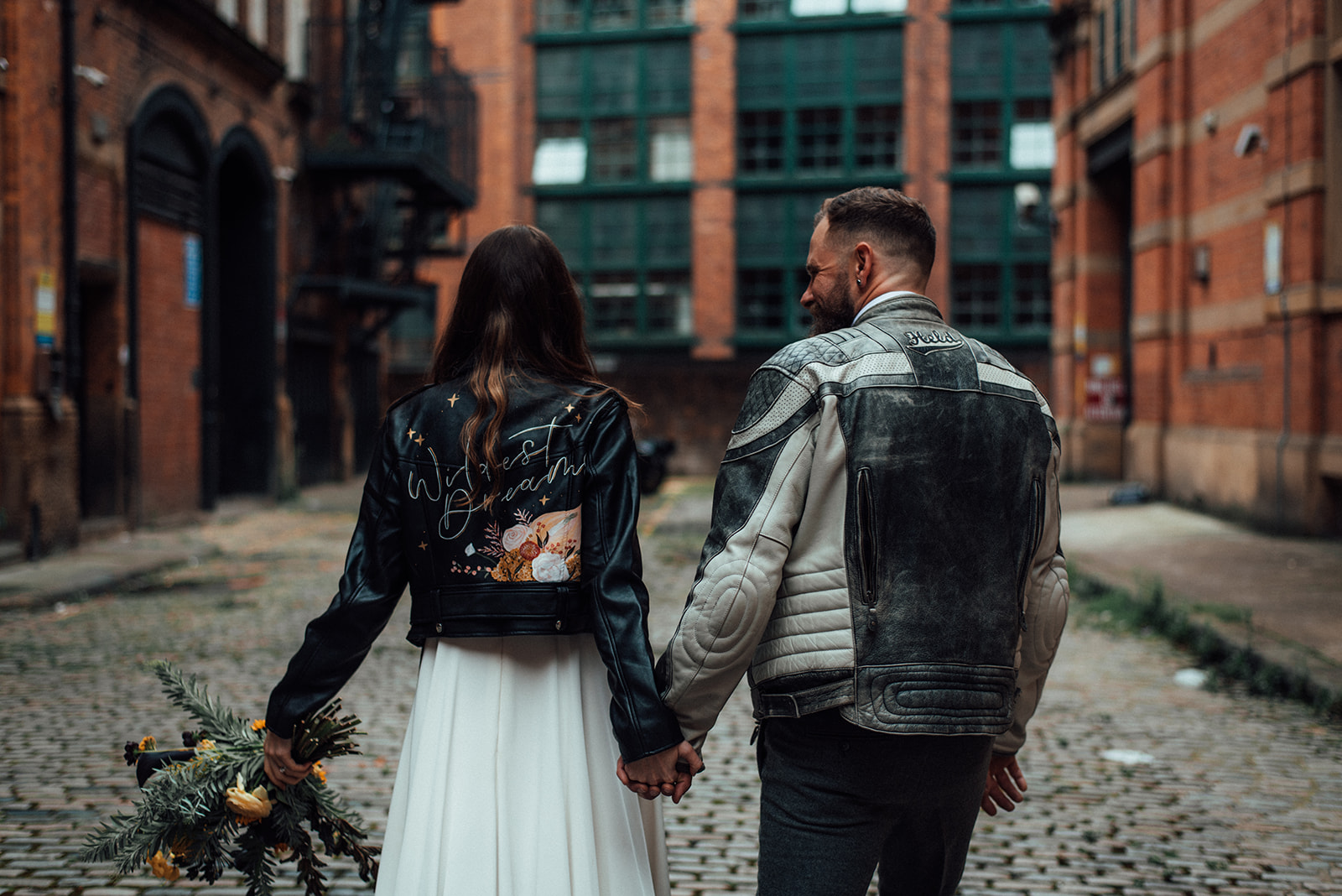
Manchester elopement styled shoot
I just loved being involved in this Manchester elopement styled shoot. I love a city-centre wedding, a cool couple and the only thing to make it better, a bike! Yes, I super gorgeous, wanted to ride off on a motorbike!!
I have decided to break my shoots down in more detail. Show you the design process and take you behind the scenes a little more. This is to help those planning shoots themselves. I struggled when I started to find information on planning and implementing a styled shoot. Or even couples as this can be adapted to designing your wedding.

The design process
For this shoot, I was approached by Chelle, a wedding planner. She had an idea that she wanted a motorbike, it to be an elopement in Manchester. She needed help getting her ideas down as a design. The first step was a venue, once she had this sorted I could work on the design of the shoot. I suggested hotel Brooklyn as I know Chelle loves New York. In her head for the shoot, it was an American couple eloping. They said yes! So with the brief and venue, I could get to work on the design!
Manchester Elopement Story
I always start with a story when doing an editorial shoot. I sit and write about the couple, what will happen, their reason for the wedding/event. What feelings and emotions are they feeling and I want to create with the design. If you are doing a styled shoot I highly recommend sitting and thinking about the story you want to tell on the day before any planning or design. The same for a wedding or event, write down the feelings you want to create on the day. How you want the guests to feel. Also, think about the story of the couple or the reason for the event.
A young couple living in New York is looking for a place to elope! The stress of the traditions and expectations of the wedding they have planned is too much! It is not them and they want to just be together and make their love official. The traditional elope in American is Vegas, a quick drive-by style wedding! Again, just not them, even though they loved the concept.
They met while travelling Europe and always vowed to go back together one day. Then it hit them, we go to Manchester the place we met and we elope. Mixing our New York style vibes, the fun drive by feel of a Vegas wedding all together to create the ultimate elopement.
Cool, modern, fun couple. Totally in love and looking for an adventure they will remember for the rest of their lives.
A modern couple so the styling needs to be cool, minimal and modern. With the bike, I came up with the idea of driving in and out of the hotel for the drive-by feel. Then the colours of New York with the yellow and black. Again, still modern, urban and stylish!

The mood board
Once I have the story and couple, if a wedding shoot, in my mind I then go and look for inspiration about them. Think ideal client work, one for the business owners reading this. The couple is cool, modern and want to be different but also want to bring a piece of them to Manchester. With this thinking, I went with the traditional new york colours, black and yellow. I softened with some grey and made sure the yellow was only in pops. Look at my colour palette guide for how I create my colour palettes in more detail.
I searched Pinterest, not for wedding photos, New York City streets, Brooklyn vibes, yellow and black patterns. Then I searched 90’s high fashion, 90s supermodel shots. I wanted paparazzi style, high fashion city street photography. Also, I looked at motorbike photography and leather jacket images and lastly modern yellow florals. Head to my Pinterest blog for more details on selecting non-wedding photos.
Selecting Pictures
I then set up my mood board template and start to build the mood board. This is the time to carefully curate your pictures to showcase your ideas. When looking and saving to Pinterest, or wherever, you can save any you like. As you are just allowing yourself to fall into the design and ideas deeper and deeper. Now you need to examine each picture. Write the keywords you want to create within the shoot. Then pic the photos that show these words. You can’t be half-hearted about this. You can’t just think that will do. A picture that screams the mood you want to create but is totally the wrong colours. A picture may have some elements but a little traditional when you want modern. These work for extra pictures but not for the mood board.
You have to remember this is going out to all the suppliers. Each person will connect and see something different in each photo. They all have to be spot on, every element, colour, detail has to work for that shoot. If not, don’t use it, get looking for another. I can spend days, usually weeks, okay I’ll admit months sometimes, working on mood boards. Head to my 5 step guide for creating a mood board for my full in-depth process.
Selecting Suppliers
This is sooooo important! Putting a call out on a group, or on your socials really isn’t the way to get the right suppliers. That’s my opinion though, others do this and have a great shoot. I suppose it depends on the reason for the shoot. When designing a certain look and feel you need to search out the right supplier for that shoot. I go into this in more depth in my styled shoot guide. I also touch on the protocol of paying for suppliers and who pays who.
You need to consider each area and what elements you need to create them. Then search for suppliers that can do this and are the same style as the look you want to achieve. For this shoot, I was just doing the design so Chelle went off and sourced the suppliers she wanted. This can be hard if you are a stylist or designer at times. If the supplier is not suited then it will show and your design can be easily lost. For me, I step away and accept that I have done the design brief and will work with what I have on the day to best style the elements. It is their vision not mine at the end of the day!
Collaborating
I will always talk through certain elements with key suppliers if styling also. I make a design brief and each element of the shoot is considered in this. Each key supplier will have a section tailored to them. Then all suppliers will receive a copy of the design brief. This is the best way to keep things cohesive and make sure all suppliers are working towards the same vision. I like to choose suppliers carefully so I can give them the creative space they need to create something that suits the design brief.
I knew a lot of the suppliers or at least knew of them so it worked out well. Chelle did a great job selecting the supplier that was the right fit on the day.


Styling
With a shoot, things are different from a wedding or event. The supplier I am always most conscious of is the florist. I spend a lot on items with a shoot as I always want it to be unique and offer something new. Because I want luxury, the best and with this comes a cost. I am more than aware though that the cost for the florist is usually a lot more. This means you need to be creative and thoughtful with the styling on the day. Reuse items and especially flowers throughout. Meaning, you need to give yourself self-time to set up each area and move elements and set up the next throughout the day.
As this shoot was an elopement it was nice that there wasn’t a lot of setups. I had a table for two and a cake area! It was a lovely chance to have free time during a shoot to network and relax!
The table
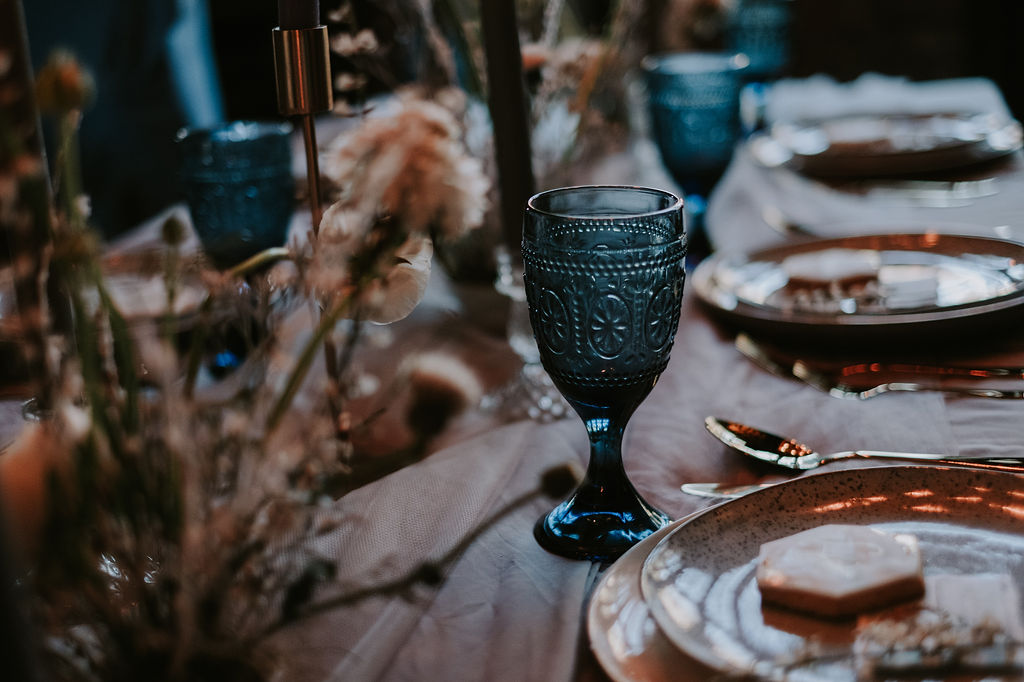
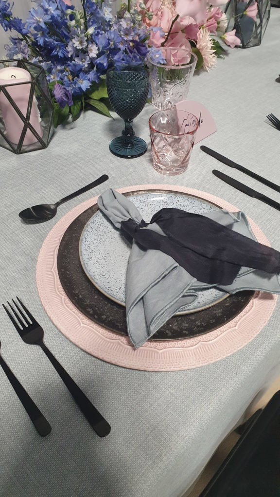
A table for two! I love doing sweetheart tables for a wedding also, going all out so this was definitely my jam! This one was a little different as they needed to face each other. Straight away I was excited to do an off angled runner. You may have noticed I do love layering of angle with my fabrics! I knew Chelle was using a stunning dipped dye Lucy can’t dance dress. So, I wanted to do something similar and created a dip-dye table runner.
I kept the table minimal with black and grey elements. The yellow only from the flowers. I used these stunning plates from Nkuku, black crockery and nice simple grey napkins. We didn’t have a stationer so I made my own with a template from Etsy.


The cake area
I love styling a cake area! This one we went for a dessert treat table for two for them to enjoy. A gorgeous black cake and cool modern treats made my styling job so much easier. I used another dip-dyed table runner and then a mix of plates and terrariums from my styling collection.
I kept this styling minimal also, let the treats do the hard work! We moved the flowers over from the table to reuse and also add some yellow. It is important to mention here about the placement of the table. I choice in front of this sign to add to the whole are styling. Picking where you set up is key with a shoot and an event. Look what is behind and speak to your photographer about lighting, background in shots and make sure it will work.


Manchester elopement
Hopefully, you can see the elements of the design within the shoot. Chelle chose not to go for the more high fashion vibe with the city street shots. I love them all though and it is totally more her style! Enjoy scrolling the pictures and let me know what you think in the comments below! If you want to see the full portfolio and hear more about the shoot its self head to here now!
Supplier Credits
Planner: MICHELLE AMY WEDDINGS, DESIGNER: ZOEY LOUISE DESIGN, PHOTOGRAPHER: MARNI V PHOTOGRAPHY, VIDEOGRAPHY: CATHERINE LUTHER WEDDINGS, FLOWERS: FLOWER STUDIO MCR, CELEBRANT: CELEBRANT SJ, VENUE: HOTEL BROOKLYN MCR, DRESS: ROCK THE FROCK CHESHIRE, SUIT: GROOM WARRINGTON, HMUA: KATIE, JACKET: ROCK PAPER NIB, CAKE: GRACE EMILY CAKES, ACCESSORIES: GLORIOUS BY HEIDI, COUPLE AND BIKE: HELEN & STEVE.
- Emerald Green wedding color ideas for a stylish wedding

- Bridal Shower Schedule – Order of Events and Free Itinerary Template

- Mastering Your Bridal Shower Budget: A Complete Guide and Budgeting Tips

- I Spy Wedding Game Free Template and tips to creating your own

- Wedding Monogram, Logos for your Wedding Stationery – Free Template

- Emerald Green Bridesmaid Dress Ideas

- Top 2024 wedding styles for an aesthetic vibe and how to create them!

- The Hottest Sage Green Wedding Ideas for Every Season and Style

- Creating a Wedding Seating Chart, Minus the Stress with My Template!

Spring wedding color palettes. Spring, the season of new life! The world starts brightening up, lighter days and everyone has a spring in their step! Okay, a little corny! But for me also true, I start to feel better, and healthier and my mood lightens with spring.
So of course for me, a spring palette needs to be fun, playful, and colorful. But also light and refreshing. For this, we have to choose our colors, shades, and tones carefully to create the perfect spring color palette. Toning down colors works very well and is usually associated with pastel colors. You can have a bright colorful palette that still feels fresh as the colors are toned down.
Colour palette basics
So I like to break my palettes into 3 colors for most events. I have my base color which is the one used in 80/90% of the design. Then the main color is the color of the event or wedding. The color everyone remembers. You want to use this in pops though, not all over the space so it becomes overpowering. Remember with both of these colors you want to mix in different shades and tones. Don’t stick to the same exact color for every little item.
Then you have your accent color, usually a metal like gold, copper, or brass. This can definitely be a color also though. This I use to either tie the colors together or add contrast if needed. You will be surprised how much effect an accent color can have on the overall design.
You can of course add in a contrasting color or do a mix of colors. It really does depend on the overall design of the day. But for the majority of my weddings, we work with this style of the palette. If you are new to event design or designing your own then this is the easiest way to build a great palette. I think spring is a good time to mix it up though and really play with your color scheme and mix up the way you use your colors.
Top 5 spring color palettes

Colour Palette 1
Pantone color of the year 2021, yellow and grey! Yellow is the perfect spring colour. In this palette, we included the light grey to work with Pantone colors, adding tints to draw it into white. Then the same with the yellow but deepening the shade of yellow heading into the mustard color you see above. The accent is gold, again to playing on using a mix of yellow shades and tones, you can think of gold and a metallic yellow in a way as it is so similar.
This is a perfect fresh yellow colour scheme. It works for spring and summer weddings. You can mix it up and change the base or accents or even the yellow shades to get it to work well in Autumn or winter.


Colour Palette 2
I love that this palette is modern, simple but packs the wow factor. Here you can swap the main colour to any colour and it will still give a cool modern feel. Yellow works well, it is a great way to do pink also but still have a modern feel.


Colour Palette 3
I love this one for a spring palette. I think it is also a great example of how much changing the shade or tone of colour really affects its overall feel. Using lighter shades of purples and pinks gives a soft beautiful palette. Using the lighter grey as a base softens the feel even more and adds a little freshness, perfect for spring.

Colour Palette 4
This palette is the perfect spring or summer red palette. The greens in the accent come from the greenery in the flowers. Crisps whites help the reds really pop. Giving a bright colourful and fresh palette. It is the perfect spring garden color palette.
Adding lighter reds will give a brighter, softer feel. Going with darker reds adds drama, and created a bold palette. It is definitely the palette for rose-loving couples! All you need is lots of greenery and all the shades of red roses and you have the perfect garden wedding style, any guest would be honoured to attend!
This is perfect for an outdoors wedding. Or if you want to create that garden feel indoors. Using pink and red roses as if natural growing around the venue gives a beautiful secret garden vibe. Here we have taken the red and adding more and more amounts of white lightens it to create our pinker shades.

Colour Palette 5
The perfect way to do a multicolour scheme in springtime! I love a modern pastel palette! It is a huge spring trend and I have seen some amazing shoots using this palette! Fun, bright and bold! You can really get creative, with modern floral designs it add a artistic modern playful feel to the day.
It is the perfect choice to use with another huge trend, curved shapes galore! I am loving the backdrops, stationery and everything curved! It add such a modern feel, gives the design a some fun but stylish elements. So I decided that this one will be the one I do some digital designs for.
Backdrop mock ups
With my full design clients, I love to focus on the detail of the design. I always do these mockups. Usually the table setting and any feature areas or focal points of the day. If I or my couples can’t envision a certain design these are how I show them and fine-tune the tiny details myself. Now, if I could draw I would but my creative skills never spilt into drawing skills!
So we are working with Palette 5. We have the overall moodboard, this is a quick design moodboard. My couples get one for each area plus a brief in their design plan.

A normal wedding mood board would be more in-depth than this. I still try not to include to many wedding shots. Flowers are okay but not completely styled looks. We want to be creating something unique not copying.


Spring wedding color palettes
I hope you found this blog useful and you are now full of spring wedding ideas. Remember to keep it simple with your base, main and accents. Use slightly different colors or shades to add depth and interest to your design.
Check out some more wedding design blogs.
- Emerald Green wedding color ideas for a stylish wedding
- Bridal Shower Schedule – Order of Events and Free Itinerary Template
- Mastering Your Bridal Shower Budget: A Complete Guide and Budgeting Tips
- I Spy Wedding Game Free Template and tips to creating your own
- Wedding Monogram, Logos for your Wedding Stationery – Free Template
- Emerald Green Bridesmaid Dress Ideas
- Top 2024 wedding styles for an aesthetic vibe and how to create them!
- The Hottest Sage Green Wedding Ideas for Every Season and Style
- Creating a Wedding Seating Chart, Minus the Stress with My Template!
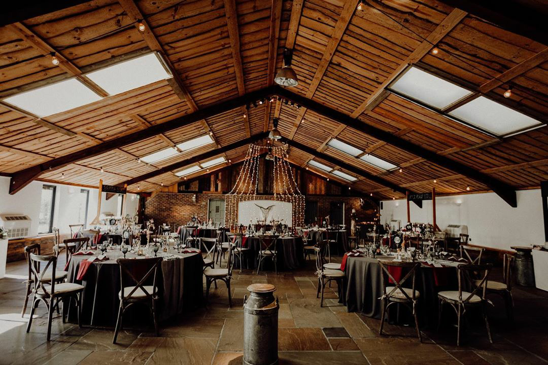
Moody Boho was the order of the day at Owen House wedding barn! Gemma and Jamie wanted a boho feel to the day but wanted it to be a bit edger. It also and to be fun and relaxed! So moody boho was born. We used dried florals and grasses and macrame in deeper darker shades to give a moody feel. While still having relaxed boho vibes.
The venue, Owen House wedding barn.
Owen house wedding barn in Mobberly Cheshire is the perfect venue for a moody colour palette. The barns natural wood and metal elements already give a warm moody feel to the venue. So I worked with the elements of the venue enhancing and playing on the natural darker feel.
The venue is great space. It has everything a couple could need to have the perfect stress free day. The 2 areas for both of the couple’s wedding party to get ready in. They have onsite accommodation and more space near by. Owen House is still a working barn so lots for the guests to see on the day and morning after. My favourite area as to be the photo shed! No need to go find the perfect spot for family and couple pictures they have perfect space with all your photography needs! The fairy light wall is stunning!


Ceremony styling
For the ceremony, we went with fairy lights and candles for a romantic feel. We used large dried grasses from just Dalilah mixed with pampas grass to give a natural feel. I wanted to create shadows and movement with the darker room lighting with the fairy lights and candles flickering. It really was a beautiful ethereal feel.
The ceremony room is next to the main reception room. It is turned into a chill area after for the guest to relax and enjoy a quieter space.


Table and reception styling
For the wedding breakfast, we carried on the moody boho feel. We used a palette of mixed grey shades and black for the base. Deep dark reds and burgundy for the main colour and copper for the accent. The colour palette worked perfectly in the space. Using a mix for the base meant that we could lighten the palette slightly by adding the lighter greys on top of the blacks and dark greys. Head to my wedding palette blog to understand more about how I create a colour palette.


Moody boho wedding styling at Owen House wedding barn
Gemma and Jamie were an amazing couple! They wanted a design-focused day and was clear on their vision but they also wanted it relaxed and fun! I think we nailed it they are their guests had an awesome night!
If you are looking for help with wedding design or styling get in contact I would love to chat!


Red wedding color ideas. February is the month of love! But also I think it is the month of red! So this week I am sharing my top red color palettes. I love how taking a color and mixing it with different colors can change the whole feel of a design.
So I am mixing it up and showing how versatile red really can be! No matter your style, theme, or season red can work for you! You will find a red wedding color scheme to fall in love with!
Colour palette basics
So I like to break my palettes into 3 colors for most events. I have my base color which is the one used in 80/90% of the design. Then the main color is the color of the event or wedding. The color everyone remembers. You want to use this in pops though, not all over the space so it becomes overpowering. Remember with both of these colors you want to mix in different shades and tones. Don’t stick to the same exact color for every little item.
Then you have your accent color, usually a metal like gold, copper, or brass. This can definitely be a color also though. This I use to either tie the colors together or add a contract if needed. You will be surprised how much effect an accent color can have on the overall design.
You can of course add in a contrasting color or do a mixed color. It really does depend on the overall design of the day. But for the majority of my weddings, we work with this style of the palette.
Top 5 red wedding color palettes

1. Moody berry red wedding
As you can see with this red wedding color palette there is one base color, a mix of 3 for the main and then the accent. For me here the main colors are two colors molding together and all the shades and tones in between that melt together to make the beautiful burgundy. Which to me is the perfect mix of purple and red.


2. Red, Grey, and Black
I love that this palette is modern, and simple but packs the wow factor. Here you can swap the main color to any color and it will still give a cool modern feel. Yellow works well, it is a great way to do pink also but still have a modern feel.


3. Red, pink and terracotta
I love this one for an autumn palette. It is the perfect modern boho vibe. Swap the pink base for a cream base add all the macrame you can and you are in boho heaven. Again the main colors some would say are 3 colors. They are one hue and the shades and tints are from darker to lighter.
4. Best red spring wedding color scheme
This palette is the perfect spring or summer red palette. The greens in the accent come from the greenery in the flowers. Crisps whites help the reds really pop. Giving a bright colorful and fresh palette.
This is perfect for an outdoor wedding. Or if you want to create that garden feel indoors. Using pink and red roses as if natural growing around the venue gives a beautiful secret garden vibe. Here we have taken the red and added more and more amounts of white lightens it to create our pinker shades.

5. Red and Pink
The modern way to do red and pink! I love this palette as you can play around with the shade of grey to change up the overall feel. The darker the grey even edging to black the moody the feel. Using mainly light grey will add some freshness and lighten the look and make the red and pink pop more.
Tablescape mockups
With my full design clients, I love to focus on the detail of the design. I always do these mock-ups. Usually the table setting and any feature areas or focal points of the day. Or if I or my couple can’t envision a certain design these are how I show them and fine-tune the tiny detail myself. Now, if I could draw I would but my creative skills never spilled into the drawing! I am so bad!
So we are working with Palette 5. We have the overall mood board, this is a quick design mood board. My couples get one for each area plus a brief in their design plan.

A normal wedding mood board would be more in-depth than this. I still try not to include too many wedding shots. Flowers are okay but not completely styled looks. We want to be creating something unique not copying.
So for this, we want the table to have a modern moody feel, that was still relaxed and welcoming. We still want it to feel elegant and stylish and of course full of romance. This is done by using organic floral displays in pinks and reds. Then just some extra carefully chosen pieces to finish off the centerpiece design. Then clean simple and minimal table settings. Also, something often overlooked the chairs play a large role in the feel of the room. the wood a similar shade to the copper works well and the more relaxed feel of the chairs makes the room more welcoming.


Red wedding colors
I hope you found this blog useful and you are now full of red wedding ideas. Remember to keep it simple with your base, main, and accents. Use slightly different colors or shades to add depth and dimension.
Check out some more wedding design blogs.
- Emerald Green wedding color ideas for a stylish wedding
- Bridal Shower Schedule – Order of Events and Free Itinerary Template
- Mastering Your Bridal Shower Budget: A Complete Guide and Budgeting Tips
- I Spy Wedding Game Free Template and tips to creating your own
- Wedding Monogram, Logos for your Wedding Stationery – Free Template
- Emerald Green Bridesmaid Dress Ideas
- Top 2024 wedding styles for an aesthetic vibe and how to create them!
- The Hottest Sage Green Wedding Ideas for Every Season and Style
- Creating a Wedding Seating Chart, Minus the Stress with My Template!
Pinterest is a great marketing tool for a wedding or any creative business. It is also a tool to start creating a wedding mood board.
I am going to discuss how I use Pinterest as a wedding mood board. I use Aisle Planner for the main design process with my full design couples.
Usually I always also have a shared secret mood board. It is great to add things as we are both searching or something pops up. I love that you can add a note for others to see.

The right way to use Pinterest for a wedding mood board.
Now I think there is a right and wrong way to do a Pinterest board! I am sure others will disagree with me though!
The thing with Pinterest is it is easy to get sucked into beautiful weddings or shoot pictures. You then fill your boards with these. However, you are then just working on recreating someone else’s design. Use the sections option and get strict with what is going to be shared in each.
I am going to share my process and this can work for a wedding supplier to set up for a shoot or with couples. But also perfect for couples looking to design their own day like a pro.
Pinterest wedding mood board
I go into more detail in my mood board blog on how to create a great mood board.
The same principles apply here though. You need to look past weddings, past the item you are creating.
I allow my couples to bring 4/5 wedding pictures but I want them to bring my pictures that ignite feelings when doing a design consult.
Show the colors, textures, or feeling you want on the day. For Pinterest, though I have an inspiration section that I don’t limit. I find the inspiration section is a great place to photo-dump all the different things you like or that catch your eye.

Set the main Pinterest board into sections.
Here are the sections I add and the description or advice I use for each. I think this can work for any design or event. You can adapt and add sections that work for you. These are just ideas.
- Colors – Search and add pictures of colors you like or know you want for your wedding. No wedding pictures. Look for pictures that include colors or show color tones, and shades you Like. Write a note if the picture needs explaining.
- textures – add fabrics, and textures that you love or are drawn to.
- stationery – add fonts and paper textures. try to limit the amount of wedding stationery
- outfits – add all wedding party outfits you like or if decided add your chosen ones.
- Flowers –
- ceremony –
- reception –
- stationery –
- inspiration – add wedding inspiration here. try to look past the setup or look and add pictures that make you feel the way you want your guest to feel.
Pinterest wedding mood board
I may set up new sections for different feature areas. Or if a certain supplier is a top priority to the couple they will be added and we will have a section for them.
As I use an Asile planner though this is usually shared through this instead and a new section is not needed.
I use this Pinterest board to break down the overall feel and design the client wants for the day. This is not what is shared with suppliers but at times I will add suppliers so they can contribute also.
I use this to help with getting to know my couple and questions at the meeting to then create an overall design. The design brief goes into detail about each area.
The design brief is then shared with all suppliers. As it is not an interactive process having a Pinterest mood board works well alongside this.
Using Pinterest as a wedding mood board
I hope you found this blog sharing how I use Pinterest as a wedding mood board! please let me know in the comment and any questions ask away! Here is a quick video of how to set up a board and sections on Pinterest.
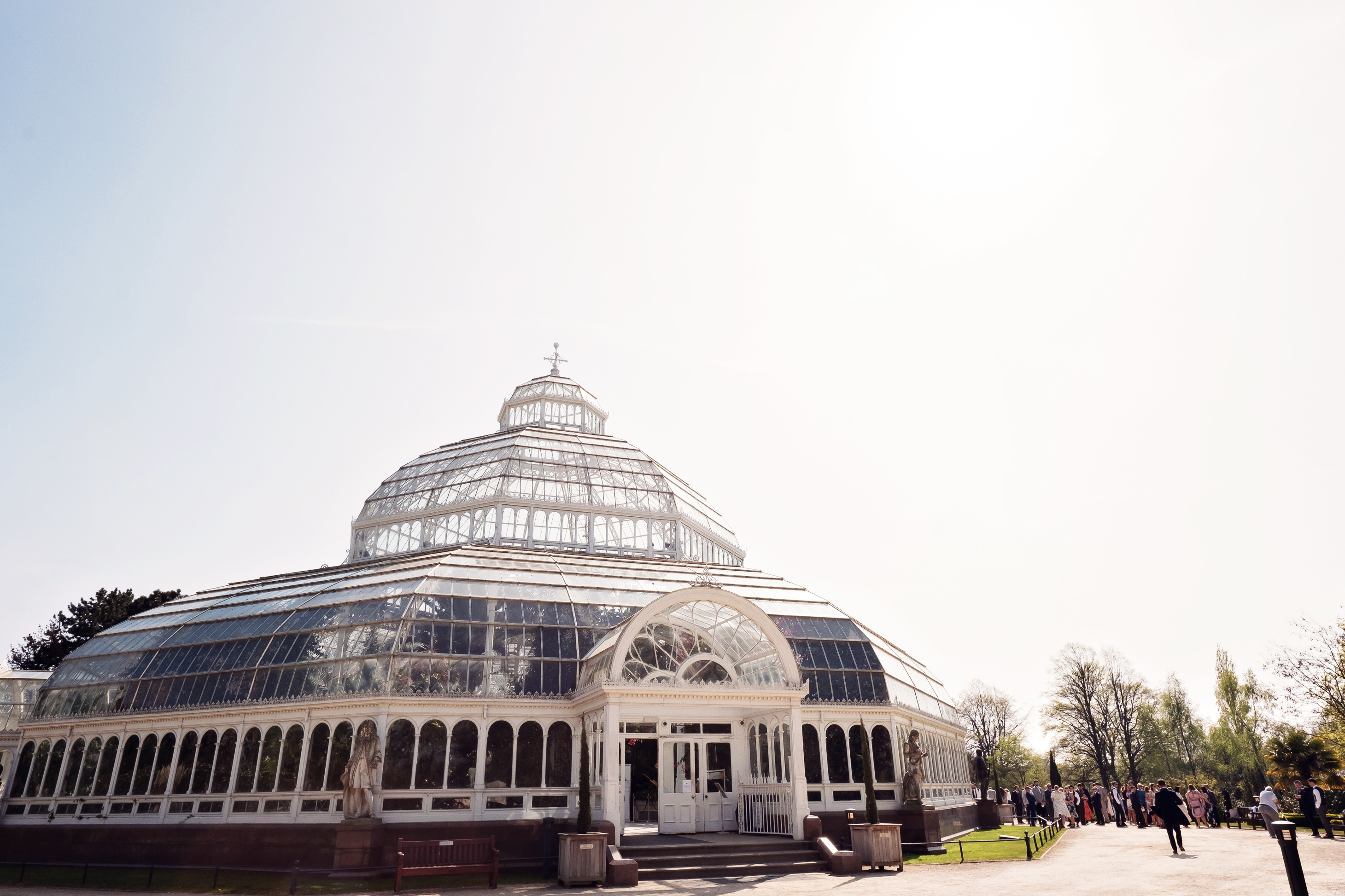
This Liverpool wedding was a dream, the venue wow! It was so magical, green forest in the city to comes to mind! The couple and all the suppliers were also a dream. The Palm House at Sefton Park is the perfect city wedding venue for couples still wanting lush grounds.
The only thing I would change from this day was the heat! Glass building in the heat while climbing ladders, moving chairs and running around like a crazy person. Let’s just say I sweated a few pounds away that day, yikes! Urban jungle kind of theme for this wedding. They wanted a modern cool industrial feel in the beautiful lush surroundings of the venue. We used lots of copper, neon and geometrics! mixed metallic, white and green colour palette.
The cake also didn’t like the heat! The cake maker had to make a dummy cake that looked identical and bring the cake cut up already. It was already melting with the heat and it would not have lasted 5 minutes in the glass dome of the palm house.


The couple never knew about the cake drama, which is the way it should be. Remember things will go wrong on your wedding day. Having a great team of suppliers you trust means that you will not have to deal with it. most of the time you will never know!
We also had an issue with a neon sign the couple ordered. It came with a strange plug, not foreign it was explained to me but all I knew it was going to turn on! After 4 shops later we managed to get an electrical shop to wire a plug on so it would work! Again the couple never knew! A bonus to having a city Liverpool wedding I suppose! not sure what we would have done in the middle of nowhere. The couple hired a neon sign from the word is love but also had one made to keep after, such a great idea and a lovely keepsake.


The couple and a beautiful day and the guests looked like they had an amazing time. Feast your eyes on the beautiful gallery below. If you are planning a wedding a The Palm House or any other venue get in contact and I would love to chat with you!


Make sure you check out all the amazing suppliers!
- Images: Teresa C Photography
- Venue: The Palm House
- Styling: Zoey Louise Design
- flowers: The Flower Barn
- lighting: Ultra Lighting
- cake: Rosin Flinnneon
- Neon sign: The word is love
- stationery: Hawthorne and Ivory
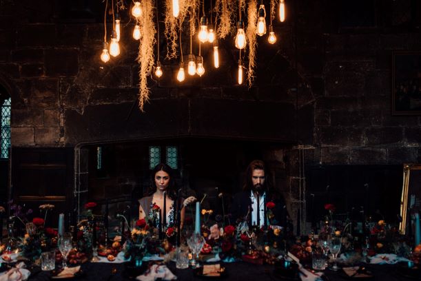
I have the most epic Beauty and the beast wedding styled shoot for you.
This is not your typical Disney version. Moody, decadent, and oh-so-beautiful.
For me, styled shoots are a chance to get creative, push boundaries and show a little bit of my personality.
For the beauty and the beast shoot, I wanted to be able to show that you can have a theme for your wedding.
Without it being overpowering, tacky, full-on, or cheap looking.
Also, show that Disney doesn’t always have to be a pink pretty princess wedding!

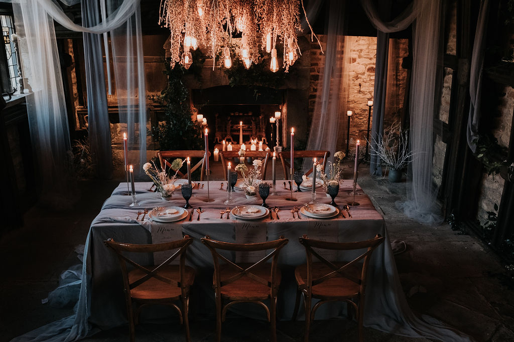
A library venue in Manchester city center
It was more about the meaning of the fairy tale rather than the Disney version.
‘Tale As Old As Time’ so of course number one on my list was to find the Old perfect building that had to have a library!
Wow well, I think we hit the jackpot when it came to Chetham School of Music. The oldest building in Manchester and wow what a library it has.
I have mentioned this but I do love a unique building that is either full of character, and history or has some raw natural beauty and this one was just full of all of this.

A metal rose wedding favor
The next thing to include was the Rose, of course, yes we can have red roses in the flowers but come on a little obvious.
We did a bit of searching and digging and I came across the most beautiful metal Roses, these are stunning!
I think they would make the perfect alternative to bridesmaid bouquets and then make the perfect present for your bridesmaids.
Just imagine how beautiful they’re going to look walking down the aisle holding them! Go check them out!


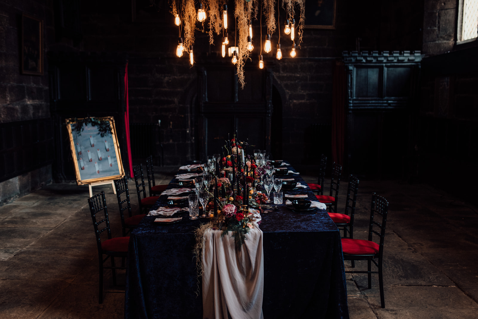
A moody fairy tail wedding
I wanted to show the dark side of the fairy tale but also still hold the beauty behind the story.
I chose to do this with a lot of contrast which again is one of my favorite things. Yes, we had dark linens but I chose rich velvet fabric.
Dark moody flowers in abundance on the table add an opulent feel, amazing as always for Kate. Finished off with a soft chiffon runner and napkins.
Then stone crockery and cut crystal glasses. Kind of like a medieval feast in ways, you can just imagine them sitting around the table like this full of food in the old days…… no just me?
Thinking about having a red wedding color palette? head to the blog now!


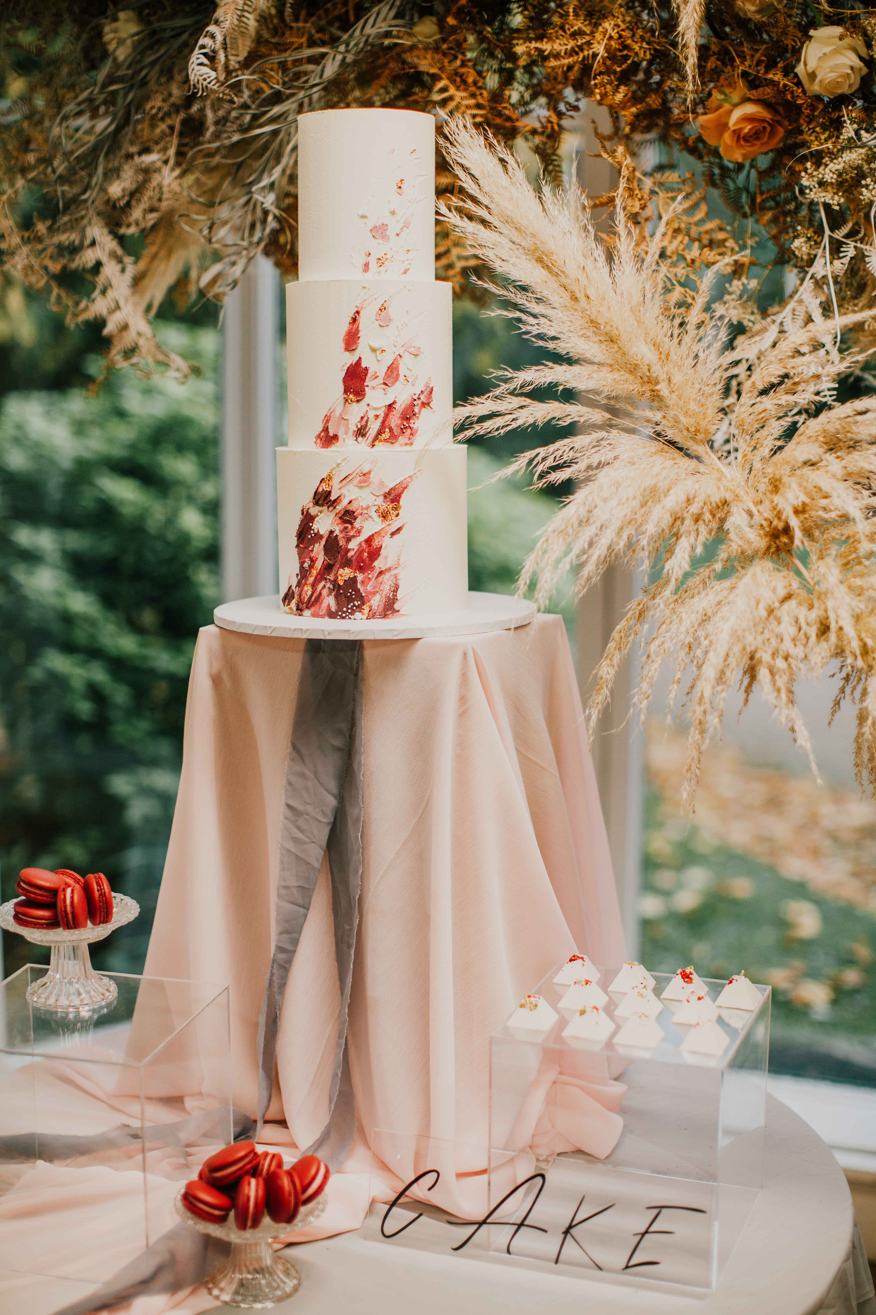
Beauty and the best black wedding cake
Then for the cake area, designing a good cake area is so important to me.
I knew I wanted a dark black cake (Lisa did a great job on this!) and something different for the setup.
I have started to fall in love with the increasing number of food platters I saw popping up on Instagram. I knew it would make the perfect addition to the cake area!
Little green platter are a must at your next event!
This carried on the idea of the feast feel from the table styling.


Beauty and the beast wedding styling
Beauty and the Beast is about loving each other for who you are, deep soul love.
Designing people’s weddings is all about finding the inner personality of a couple.
Why do they love each other and then be able to tell that love story to all the guests?
Marni captured all the design and the story of the day. The way she catches light, mood, and moments in a picture is just incredible!
I also have to give a shout-out to the amazing dress and stationery. It was like the dress was made for the shoot, we couldn’t have asked for anything more perfect from Legend Bridal!
The stationery finished the design perfectly, again it fits o well and Frain and Grain more than smashed the brief.
Then the show stopper of the set up was the amazing chandelier, Peters Edison lights adorned with Spanish moss, so dreamy!
I would love to hear your thoughts below on this style, make sure you check out all the suppliers involved.
You will love these blog posts, check them out now!
- Emerald Green wedding color ideas for a stylish wedding
- Bridal Shower Schedule – Order of Events and Free Itinerary Template
- Mastering Your Bridal Shower Budget: A Complete Guide and Budgeting Tips
- I Spy Wedding Game Free Template and tips to creating your own
- Wedding Monogram, Logos for your Wedding Stationery – Free Template


Hi and welcome to the new look blog for Zoey Louise design. I am a Manchester-based event designer and stylist for creative couples and brands. Helping style-conscious couples and brands tell their story through thoughtful design and styling. I am a Manchester based designer and stylist but cover worldwide.
My mission is to help couples and brands authentically tell their story through design.
Eeeek! I love my new branding! Brand goals or what!!!!! I would love to hear your thoughts so leave me a comment below!
As you will know if you follow me anywhere else. My former name was bespoke events and styling. I never liked the name, I rushed to pick it and but little thought into it except that I wanted the word bespoke. Because I was, and still am, passionate about weddings or any event being personal and showcasing your authentic style!
Picking this new name was sooo hard! I just couldn’t decide! I kept going back to my name though! So, there you have it! Zoey Louise design it is! I honestly love it! Not sure Louise did trying to work with a Z and L with script font!
Now, this has been a long time coming. I have never really liked my branding and it was always a do for now sort of thing. If I am grateful for one thing in lockdown it has been the creative space to really nail my branding.
It’s funny as for me design is about creatively showing your personality in whatever it is you are designing. Telling yours or a story. I tell this to the couples and brands I work with! Here I am with cringeworthy branding and really not living by my own beliefs.


I am a control freak and it took me a while to pick someone, trust someone to do my brand how I want. Louise from fleurir online has been amazing! She got me straight away, got my ideal clients and understood my waffles, which is a hard task in itself! So here is my brand board, so gorgeous!

So, with the new brand come a small change in path. I have come to realise my passion is in the design and style of the wedding. I actually find it really hard to drop items off and walk away, weird I know but I just want to make sure they are placing and using them right! So going forward no more hire items only deign and styling. We will be offering coordination. This will be from one of my planning assistants though! As I know my strengths and timelines, spread sheets and not it! Well, a little lie, I can make a killer spreadsheet and excel sheet! Glad my maths degree comes in handy now and then! I just do not get the joy out of doing them.

The next blog will break down all my packages and how they work. I hope they are more streamlined and have been put together to make the planning process for couples as easy as possible. Also, I have a new website for all my DIY couples. I get so many requests asking about how to’s I thought a new venture/page made sense. Go check The event design toolkit out.
This blog is going to be more lifestyle. Sharing design hints and tips from all aspects of life. More about me, what I am up to. Lot’s of behind the scenes when weddings are back up and running! Also, for my brands following me there will be some business talk! Business is a big part of my lifestyle so would be unnatural to not share more of me and my life without the business chat. If you are a modern couple or brand and looking for help bringing toghter your next event then give me a shout. I love to chat all things design and always happy to jump on a call!
