This blue winter wedding styled shoot is still one of my favourite shots. I just love the venue, again it is definitely one of my favourites here in the UK. I love a weekend wedding, why not make the most of it right? This venue is suited perfectly for that vibe.
This shoot was organised by Fiona couture and she wanted it to showcase the blue winter dress she had designed. Her brief was a snowy winter wedding. I wanted to really use the power of design to give a snowy feel even if we didn’t luck out with snow on the day. Which we didn’t unfortunately.


The venue: Upper house venue Hayfield
I think it is hard to find a venue that has everything. This venue has gorgeous outdoor areas to marry or host some of the day’s events. It has historic indoor areas, even a pub! However, they also have the tipi for a modern, relaxed feel. The indoor interiors are as beautiful as the views from the windows. A rare all-round stunning venue. It is for sale so hoping it continues as a venue with the new owners.
Winter wedding styling
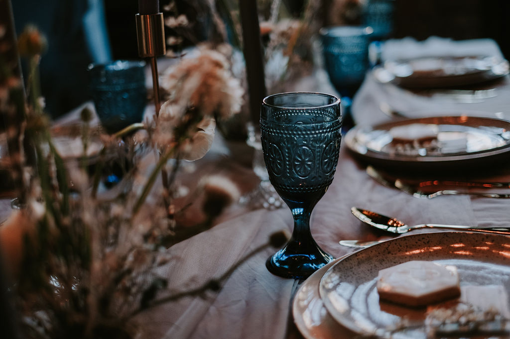
Let’s get on to the winter blue styling! Even though we were working with blue I wanted a muted blue, a dusky blue as they would say. This is explained more in my colour theory blog but toning down the blue is adding grey, here I wanted it so toned down it is hard to determine if blue or grey. Blue/grey my just be one of my favourite colours. I also used pops of a darker blue for the added interest. Then as the brief was winter and snowy we had a white base.


Winter wedding ceremony styling
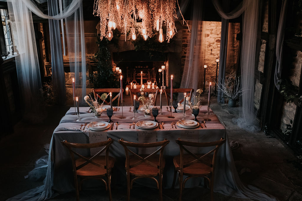
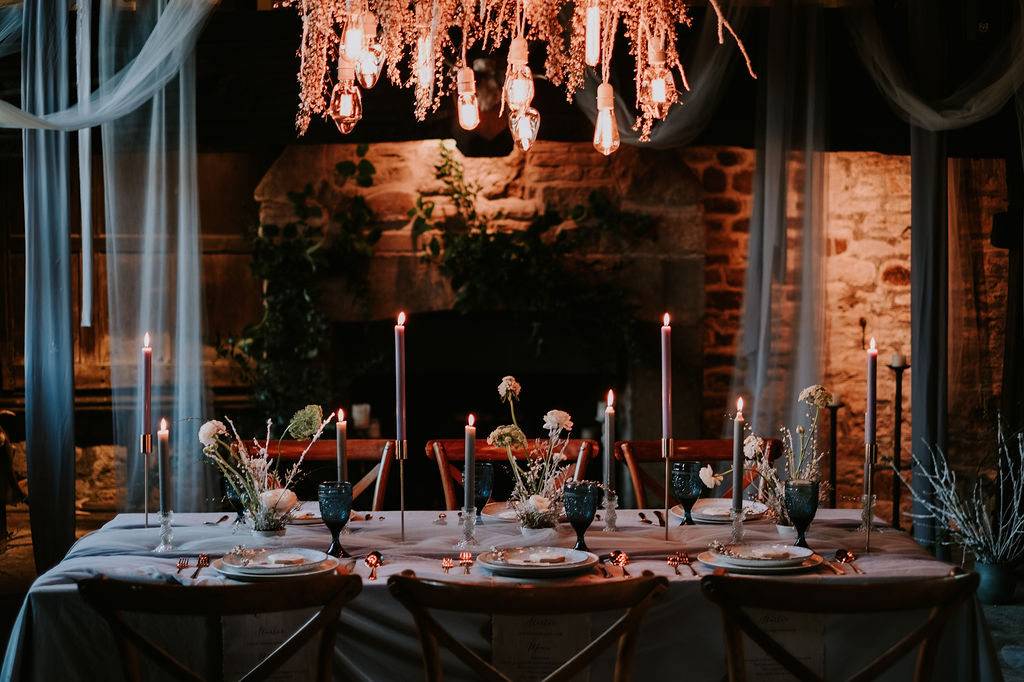
The ceremony was set up in the chapel. I beautiful historic space in the venue. The room is very dark and even though I wanted a warm moody feeling I also wanted its soft light and snow-like. I decided to cover the back in chiffon a tule, a mix of grey, dusky blue and white. Draping it as organically flowing as possible. I wanted it to soften the dark wood but also naturally mol with the setting not look harsh or stand out too much.


Table styling
We set the table up in the same room. So we got to use the fire and the insane lighting installation by Peter Lockwood Events and flowered up by Perfect bouquet full of flower. The table set under the lighting I wanted lots of layers to add depth and interest. I added a pop of darker blue with the glassware. Glasses are always a great way to add some colour without it being overpowering. And ass each guest receives one it also adds to the guest experience, everyone loves a fancy glass!


Cake area styling
The other area I wanted to make a feature was the cake area. I always love to go all out with the cake area. Its a chance to get creative, add unique personal touches and it a space that every guest sees so should always have that extra detail of attention.
Charlotte Wilcox cakes made not only one stunning cake, she made lots of extra treats. This is a great option for dessert or for snacking later. It also adds to the styling and is a great way to make a feature area of the cake table.


Outdoor winter wedding
Another amazing part of this day was the access to the outdoors. We got the bride in her winter coat and they spent a couple of hours together and we got some amazing shots. It is the perfect alone time and also you have memories captured forever. Always pre-plan your photo time, how long, what your guests will be doing and what shots you want. Then add on an extra 15/20 min for you both to just be alone and take in the amazing day.


Winter wedding styling.
I hope you enjoyed this blue winter wedding styling blog at Upper House Hayfield venue. If you are looking for someone to help design your wedding in any season I would love to chat so please get in contact. Check out all the suppliers involved.
Suppliers who contributed
MORE REAL WEDDING & SHOOT BLOGS
- Real wedding: Owen House Wedding Barn
 Moody Boho was the order of the day at Owen House wedding barn! Gemma and Jamie wanted a boho… Read more: Real wedding: Owen House Wedding Barn
 - Real Wedding: Stirk House Clitheroe
 This week I am bringing you the real wedding of David and Jo. The wedding was in the beautiful… Read more: Real Wedding: Stirk House Clitheroe
 - Real wedding: The Palm House Sefton Park
 This Liverpool wedding was a dream, the venue wow! It was so magical, green forest in the city to… Read more: Real wedding: The Palm House Sefton Park
Red wedding color ideas. February is the month of love! But also I think it is the month of red! So this week I am sharing my top red color palettes. I love how taking a color and mixing it with different colors can change the whole feel of a design.
So I am mixing it up and showing how versatile red really can be! No matter your style, theme, or season red can work for you! You will find a red wedding color scheme to fall in love with!
Colour palette basics
So I like to break my palettes into 3 colors for most events. I have my base color which is the one used in 80/90% of the design. Then the main color is the color of the event or wedding. The color everyone remembers. You want to use this in pops though, not all over the space so it becomes overpowering. Remember with both of these colors you want to mix in different shades and tones. Don’t stick to the same exact color for every little item.
Then you have your accent color, usually a metal like gold, copper, or brass. This can definitely be a color also though. This I use to either tie the colors together or add a contract if needed. You will be surprised how much effect an accent color can have on the overall design.
You can of course add in a contrasting color or do a mixed color. It really does depend on the overall design of the day. But for the majority of my weddings, we work with this style of the palette.
Top 5 red wedding color palettes

1. Moody berry red wedding
As you can see with this red wedding color palette there is one base color, a mix of 3 for the main and then the accent. For me here the main colors are two colors molding together and all the shades and tones in between that melt together to make the beautiful burgundy. Which to me is the perfect mix of purple and red.


2. Red, Grey, and Black
I love that this palette is modern, and simple but packs the wow factor. Here you can swap the main color to any color and it will still give a cool modern feel. Yellow works well, it is a great way to do pink also but still have a modern feel.


3. Red, pink and terracotta
I love this one for an autumn palette. It is the perfect modern boho vibe. Swap the pink base for a cream base add all the macrame you can and you are in boho heaven. Again the main colors some would say are 3 colors. They are one hue and the shades and tints are from darker to lighter.

4. Best red spring wedding color scheme
This palette is the perfect spring or summer red palette. The greens in the accent come from the greenery in the flowers. Crisps whites help the reds really pop. Giving a bright colorful and fresh palette.
This is perfect for an outdoor wedding. Or if you want to create that garden feel indoors. Using pink and red roses as if natural growing around the venue gives a beautiful secret garden vibe. Here we have taken the red and added more and more amounts of white lightens it to create our pinker shades.

5. Red and Pink
The modern way to do red and pink! I love this palette as you can play around with the shade of grey to change up the overall feel. The darker the grey even edging to black the moody the feel. Using mainly light grey will add some freshness and lighten the look and make the red and pink pop more.
Tablescape mockups
With my full design clients, I love to focus on the detail of the design. I always do these mock-ups. Usually the table setting and any feature areas or focal points of the day. Or if I or my couple can’t envision a certain design these are how I show them and fine-tune the tiny detail myself. Now, if I could draw I would but my creative skills never spilled into the drawing! I am so bad!
So we are working with Palette 5. We have the overall mood board, this is a quick design mood board. My couples get one for each area plus a brief in their design plan.

A normal wedding mood board would be more in-depth than this. I still try not to include too many wedding shots. Flowers are okay but not completely styled looks. We want to be creating something unique not copying.
So for this, we want the table to have a modern moody feel, that was still relaxed and welcoming. We still want it to feel elegant and stylish and of course full of romance. This is done by using organic floral displays in pinks and reds. Then just some extra carefully chosen pieces to finish off the centerpiece design. Then clean simple and minimal table settings. Also, something often overlooked the chairs play a large role in the feel of the room. the wood a similar shade to the copper works well and the more relaxed feel of the chairs makes the room more welcoming.


Red wedding colors
I hope you found this blog useful and you are now full of red wedding ideas. Remember to keep it simple with your base, main, and accents. Use slightly different colors or shades to add depth and dimension.
Check out some more wedding design blogs.
- Emerald Green wedding color ideas for a stylish wedding

- Bridal Shower Schedule – Order of Events and Free Itinerary Template

- Mastering Your Bridal Shower Budget: A Complete Guide and Budgeting Tips

- I Spy Wedding Game Free Template and tips to creating your own

- Wedding Monogram, Logos for your Wedding Stationery – Free Template

- Emerald Green Bridesmaid Dress Ideas

- Top 2024 wedding styles for an aesthetic vibe and how to create them!

- The Hottest Sage Green Wedding Ideas for Every Season and Style

- Creating a Wedding Seating Chart, Minus the Stress with My Template!

